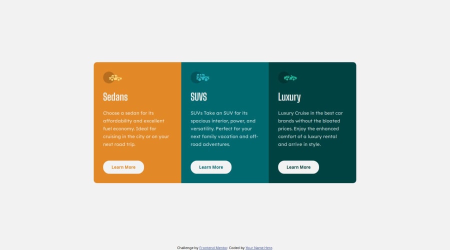
Design comparison
SolutionDesign
Community feedback
- @alaa-mekibesPosted 3 months ago
You did it, great job! Just a note regarding the width between 475px and 780px: there are some layout issues on devices with these widths. I think using a grid layout would work better than flexbox in this case. Alternatively, you can update the media query to something like this:
@media (max-width: 850px) { .main-container { margin: 20px 0; flex-direction: column; } .column { margin: 0 auto; width: 80%; } .sedans-column { border-radius: 10px 10px 0 0; } .luxury-column { border-radius: 0 0 10px 10px; } }- Or you can use
flex-wrap: wrap, like this:
.main-container {
  margin: auto 0;
  display: flex;
  flex-direction: row;
  flex-wrap: wrap;
}
0 - Or you can use
Please log in to post a comment
Log in with GitHubJoin our Discord community
Join thousands of Frontend Mentor community members taking the challenges, sharing resources, helping each other, and chatting about all things front-end!
Join our Discord
