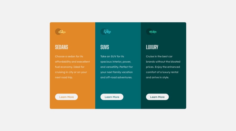
Design comparison
Solution retrospective
Kindly give your comments
Community feedback
- @Kulyk-VolodymyrPosted about 1 year ago
Good job! I would change
max-widthin@media screenfrom600to614to prevent buttons breaking.0@TechbrojuicePosted about 1 year ago@Kulyk-Volodymyr
can you elaborate on that please?
0@Kulyk-VolodymyrPosted about 1 year ago@Techbrojuice I opend component in Mozilla and after that turned on Developer tools and responsive view(Ctrl+Shift+M).When I was changing screen width, I saw that on width between 600px and 615px button's text is in two lines (loks like the button is broken). But this is some interesting behavior - without Developer tools when I change browser width manualy - buttons are fine.
0@Kulyk-VolodymyrPosted about 1 year agoI just tested this behavior in Chrome. There is a gap between 600 and 615 where the button splits into two lines. I wrote this comment because I often have similar problems))). And I don't want anyone else to have this in their practice!
0
Please log in to post a comment
Log in with GitHubJoin our Discord community
Join thousands of Frontend Mentor community members taking the challenges, sharing resources, helping each other, and chatting about all things front-end!
Join our Discord
