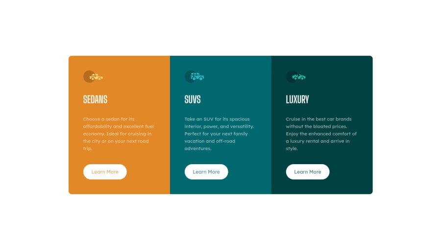


Design comparison

Solution retrospective
hello! im really happy with this one since i finished it in less than 3h Yeayy!!! \o/.
But i have a couple of questions regarding some issues that ive encountered.
- without this snippet
body { display: flex; flex-direction: column; justify-content: center; align-items: center; }
when i media query flex to transition from mobile to desktop, the cards begin split from one each other instead of staying together. why is this happening? and why the snippet above is making it work? im not quite sure i understand it completely.
and the second one is that if i use a container in order to border all my cards once like the snippet below
.container{ border-radius: 10px; overflow: hidden;
when i eventually reach the media query and have to flex the container, since the cards reside inside it, the border property stops working and my cards appear without border-radius, and because of that, i had to give border radius on cards 1/3 and include a media query for 1/3 again since the border radius shifts from when it goes column>row.
if anyone could give me an answer as to why these things are happening and how i could solve these issues i would be extremely grateful!!
cheers!
Community feedback
Please log in to post a comment
Log in with GitHub
Join our Discord community
Join thousands of Frontend Mentor community members taking the challenges, sharing resources, helping each other, and chatting about all things front-end!
Join our Discord