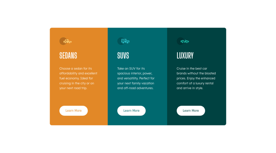


Design comparison

Community feedback
- @PhoenixDev22Posted over 2 years ago
Hello @tedaussie75 ,
Congratulation on completing this challenge,
I have some suggestions regarding your solution:
HTML
-
Page should contain a level-one heading . As this is not a whole webpage , you can use
<h1>withclass="sr-only"(Hidden visually, but present for assistive tech). -
Wrap the body content using
<main>landmark . HTML5 landmark elements are used to improve navigation .` -
For any decorative images, each img tag should have empty
alt=""andaria-hidden="true"attributes to make all web assistive technologies such as screen reader ignore those images . In this challenge , all the images are decorative. -
Clicking those
"learn more"buttons would trigger navigation not do an action so button elements would not be right. And for future, it is essential if you include a button in a form element without specifying it's just a regular button, it defaults to a submit button, so it's a good idea to make a habit of specifying the type. So use the<a>instead of<button>.
And it is essential that interactive elements have
focus-visiblestyles as well as hover styles. These need to be really clear and obvious as they are needed to help a keyboard user know where is focused on the page.-
border-radiusandoverflow hiddento the main container that wraps the three cards so you don't have to set it to individual corners. -
font-size: 62.5%;Changing base html size has huge accessibility implications for those of us with different font size or zoom requirements. There is no need to make it .
General point : Really important to keep css specificity as low/flat as possible. The best way to do styling is single class selectors.
- It's recommended to use
emandremunits .Bothemandremare flexible, Usingpxwon't allow the user to control the font size based on their needs.
Overall, your solution is good. hopefully this feedback helps.
Marked as helpful0 -

Please log in to post a comment
Log in with GitHubJoin our Discord community
Join thousands of Frontend Mentor community members taking the challenges, sharing resources, helping each other, and chatting about all things front-end!
Join our Discord