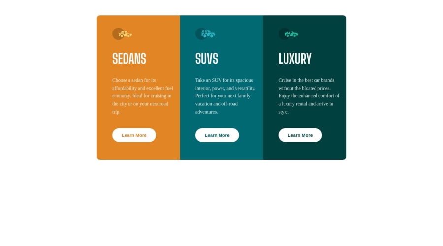
Design comparison
Community feedback
- @wdelanoyPosted about 1 year ago
Hey! Overall your result looks great!
Here are a couple of suggestions to cut down on needing to do extra work:
-
Try using custom properties/variables to define your colors in the root of your CSS file. This way, you can use the variables everywhere in you CSS code instead of using the hexcodes. This will allow you much more flexibility if you ever want to change the colors in the future. All you need to do is change the defined color in the custom property, and it will flow down everywhere you invoke that property. Take a look at my CSS file to see what I'm talking about
-
Think about using a second class for all three of your divs (.sedans, .suvs, .lux). Maybe call the class "cards". Since all 3 cards have the same margins and padding, you could define those properties just once, instead of re-defining them 3 times - 1 for each separate card
-
For your buttons, you should have all three of them use the same class instead of a different class for each one. The only thing that you would need to change inside of this class would be the color. Instead of having 3 classes and defining the color in each one to match the background, use the single class and assign the background-color property a value of "inherit". This will allow the button to inherit the background color of its ancestor, which you have already defined
Here's a link to my submission so you can see what I'm talking about:
https://github.com/wdelanoy/3-column-preview-card
https://wdelanoy.github.io/3-column-preview-card/
1 -
Please log in to post a comment
Log in with GitHubJoin our Discord community
Join thousands of Frontend Mentor community members taking the challenges, sharing resources, helping each other, and chatting about all things front-end!
Join our Discord
