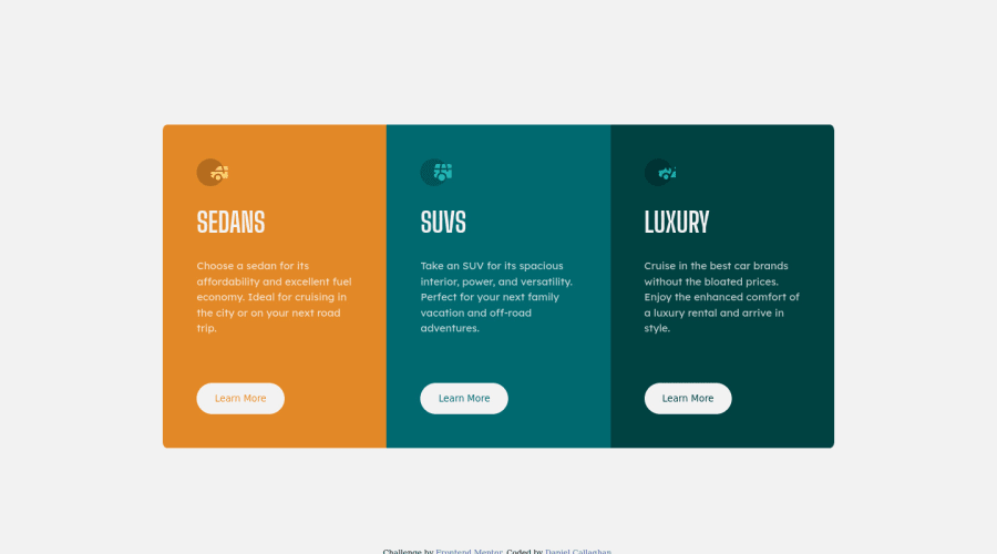
Design comparison
Solution retrospective
I feel like I don't have a good eye for judging how big a margin and padding should be based off a picture. Does anyone have any online tools they use for this? I was thinking like a digital ruler or something. Maybe a bit over the top. Thanks for looking in any case.
Community feedback
- @xiaoniuniu89Posted about 3 years ago
Thank so much, lots of great advice - I will experiment with rem next time for sure! Responsivness and using measurments is not my strong point so I really wanna fix that! much appreciated.
0 - @AlexKMarshallPosted about 3 years ago
What I usually do for measuring spaces is to just throw the screenshot into figma and draw boxes over it and see how big they are. It's also useful for selecting colours from images etc. I won't get hung up on exact pixel measurements, but just get me close enough to know if something should be 1rem, or 3rem etc.
With regards to your specific solution here, the spacing looks a bit big to me. I think that's because you're using percentage based padding, so when the containers are large, the space gets really big. I generally use rems for padding. For instance a standard container might have 1rem padding all round, and a big spacious one could get 2rem. That way they'll stay the same spacing regardless of how much content is in there and how big/small the container gets.
A couple of other notes on the code: be careful with heading levels. There are 3 cards here, so you've correctly got them at the same level. But, there can only be a single h1 on the page. That's a bit of a puzzle. It's happening because in reality this is likely to be just a part of a bigger page. So, you can either just pretend there's more content, and make them all h2's. Or you could add an overall page heading h1, and visually hide it if you don't want it to show up on the screen (look up screen-reader-only CSS utility classes). The latter approach will pass HTML validation.
Also, try and avoid making font-sizes a fixed pixel size. Always make them flexible, like 1.5rem. That way if a user chooses to zoom their screen, or adjust their base font-size, then your text will scale correctly.
0
Please log in to post a comment
Log in with GitHubJoin our Discord community
Join thousands of Frontend Mentor community members taking the challenges, sharing resources, helping each other, and chatting about all things front-end!
Join our Discord