Not Found
Not Found
Not Found
Not Found
Not Found
Not Found
Not Found
Not Found
Not Found
Not Found
Not Found
Not Found
Not Found
Not Found
Not Found
Not Found
Not Found
Not Found
Not Found
Not Found

Submitted

3 column layout/responsive flex

@agr227

Desktop design screenshot for the 3-column preview card component coding challenge

This is a solution for...

  • HTML
  • CSS
1newbie
View challenge

Design comparison


SolutionDesign

Solution retrospective


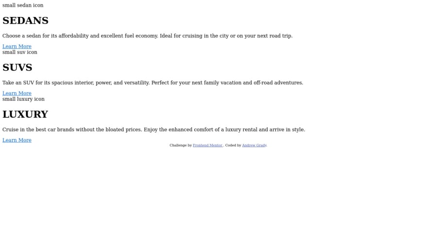
My live preview with VS Code showed everything and was responsive to the size of the page, yet my live website through GitHub isn't showing any CSS and I don't know how to fix it. Any filing/formatting recommendations to solve this?

Regarding the code, I enjoyed the challenge of using EM and REM for the first time. As well, I wanted to play around with display: flex and other Flexbox tools. I liked how easy they were to pick up and can't wait to keep practicing them!

As always, any and all comments or help are always appreciated! Sorry again if you're just seeing my HTML and zero CSS...

Community feedback

@Sk7867

Posted

Hi ANDREW GRADY, There's a small problem with all the href in your HTML code.

  1. In your stylesheet link in head it should be ./style.css due to one missing . it is not linking to your stylesheet.

  2. Your svg icons are not in images folder on github so remove ./images/ just keep ./icons-sedans.svg or icons-sedans.svg in href.

  3. Add border-radius to your container or individual divs according to design.

Happy Coding!!

0

@aUnicornDev

Posted

Haha..No worries...try to set up the Github page again... It'll take some time but it will refresh.. And then submit the solution with a new attempt.

0

Please log in to post a comment

Log in with GitHub
Discord logo

Join our Discord community

Join thousands of Frontend Mentor community members taking the challenges, sharing resources, helping each other, and chatting about all things front-end!

Join our Discord