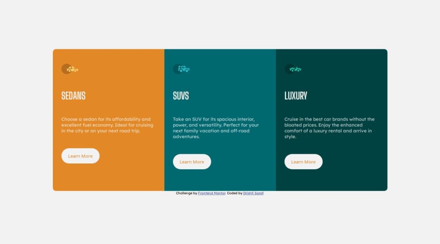


Design comparison

Solution retrospective
I am most proud of how clean and responsive the design turned out. The project challenged me to balance aesthetics with functionality, and I feel that the final layout is both visually appealing and user-friendly across devices. Next time, I would explore using a CSS preprocessor like SCSS to better organize and scale the styles as the project grows. I would also add subtle animations to buttons and icons to make the interface more interactive and engaging.
What challenges did you encounter, and how did you overcome them?One of the main challenges I encountered was ensuring that the layout was fully responsive and looked good on smaller screen sizes. Initially, the columns didn’t stack properly, and the spacing felt inconsistent. To overcome this, I carefully utilized CSS flexbox and added media queries to adjust the column layout and spacing for different screen sizes.
Community feedback
- @MarziaJaliliPosted 3 months ago
Nice work!
Here's a simple suggestion: The color of each button is different according to the design.
CSS Nesting can be a concise approach to achieve this feature.
- update
style.csslike this:
.column1 {
  background-color: var(--bright-orange);
  border-top-left-radius: inherit;
  border-bottom-left-radius: inherit;

  button {
    color: var(--bright-orange);
  }
  /* this enusres that the style will be implemented
  only for the button that is nested inside this element */
}

.column2 {
  background-color: var(--dark-cyan);

  button {
    color: var(--dark-cyan);
  }
}

.column3 {
  background-color: var(--very-dark-cyan);
  border-bottom-right-radius: inherit;
  border-top-right-radius: inherit;

  button {
    color: var(--very-dark-cyan);
  }
}
Other than this your solution is spot on!
Keep up the grind🫡
Marked as helpful0 - update

Please log in to post a comment
Log in with GitHub
Join our Discord community
Join thousands of Frontend Mentor community members taking the challenges, sharing resources, helping each other, and chatting about all things front-end!
Join our Discord