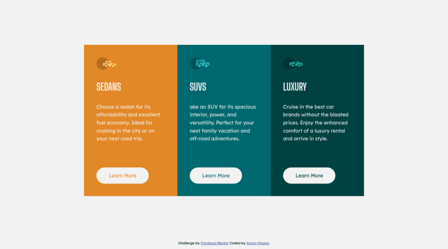
3 column component built with flex-box and media queries
Design comparison
Solution retrospective
Any comments will be appreciated
Community feedback
- @FluffyKasPosted over 3 years ago
Hey there, your solution looks very good! I really like the tablet view you made, it's a nice touch! ^^ There's a few small things you could improve:
-
For your component-container you could use a
maininstead of adiv, and the attribution could go inside afooter. -
You're missing the border-radius on the component.
-
I'd probably leave the car logo alt-texts empty, they're decorative images and don't really add much to the content. On a side note, if you do want to give something an alt-text, you can skip using words like image, picture, logo, etc. You're using a semantic <img> tag, that alone is descriptive enough for users to know it's an image :)
0 -
Please log in to post a comment
Log in with GitHubJoin our Discord community
Join thousands of Frontend Mentor community members taking the challenges, sharing resources, helping each other, and chatting about all things front-end!
Join our Discord
