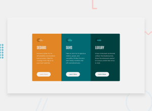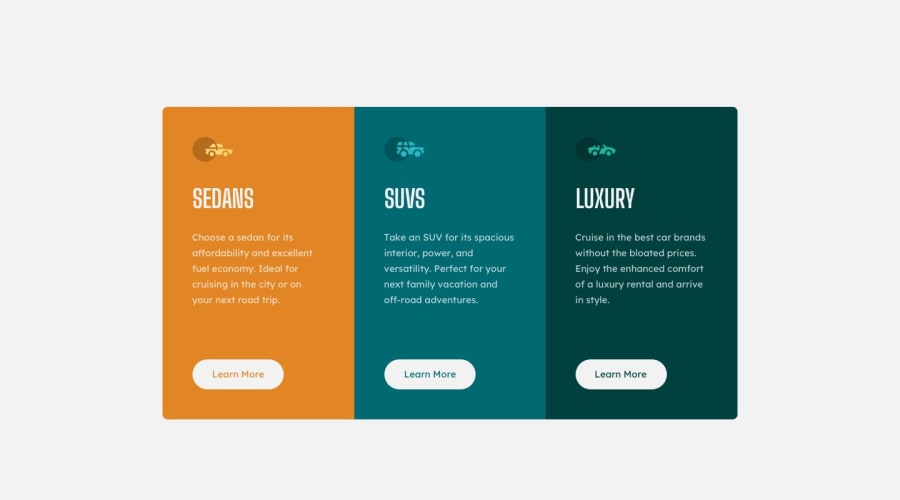
Design comparison
Solution retrospective
On a scale of 1-10, how accurate would you say this is compared to the original project design?
Is there anything that stands out as inaccurate or could be improved visually?
Community feedback
- @anoshaahmedPosted almost 3 years ago
To avoid accessibility issues in the future:
- wrap everything in your body in
<main>OR giverole=""to the direct children of your<body>... Read more here - have at least one
<h1>in your code - give ur
<img>analt=""
Good job! :)
Marked as helpful1@LyleRemsPosted almost 3 years ago@anoshaahmed Your feedback is much appreciated, thank you!
1 - wrap everything in your body in
- @brodiewebdtPosted almost 3 years ago
The design looks very good, but the mobile version gets stretched too far before you hit your break-point. I would give the mobile version a max width and center it in the viewport until it hit your break-point.
Wrap your flex-container div in a Main tag and add ALT text to the images. You can leave them empty since they are decorations. You always want to include ALT with images for accessibility reasons. You are also missing an H1 tag, but this design doesn't really use one. You can change the SEDANS text to an H1 if you want. You will have to re-style it though. Doing those things will clear the accessibility warnings.
Download AXE DevTools and you can clear accessibility warnings while you code. https://www.deque.com/axe/devtools/
Hope this helps.
Marked as helpful1@LyleRemsPosted almost 3 years ago@brodiewebdt Thank you for the feedback, I will make those adjustments.
0
Please log in to post a comment
Log in with GitHubJoin our Discord community
Join thousands of Frontend Mentor community members taking the challenges, sharing resources, helping each other, and chatting about all things front-end!
Join our Discord
