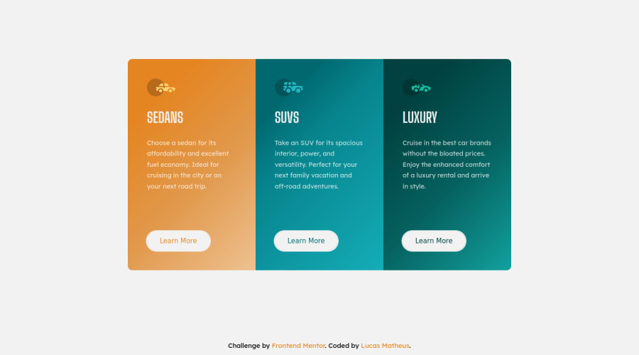
Design comparison
Solution retrospective
I'm back! I missed this community, getting back on rails with this wonderful project, i loved making it, vanilla css and html just fits. <3
As aways, i'm open for any suggestion and critics, have a nice day :)
Community feedback
- @AdrianoEscarabotePosted almost 2 years ago
Hello Lucas Matheus, how are you? I truly loved your project's outcome, however I have some advice that I hope you'll find useful:
I noticed that you used a
buttonin which case the best option would be ana, because in my head when a person clicks on a button written Learn More, he is not confirming a form, or something like, it will be redirected to another page, to Learn More about!to solve this problem do this:
<a href="/" class="card__button">Learn More</a>Consider using rem for font size .If your web content font sizes are set in absolute units, such as pixels, the user will not be able to re-size the text or control the font size based on their needs. Relative units “stretch” according to the screen size and/or user’s preferred font size, and work on a large range of devices.
if you want to continue coding with px, you can download a very useful extension in vscode, it converts px to rem! link -> px to rem
The remainder is excellent.
I hope it's useful. 👍
0
Please log in to post a comment
Log in with GitHubJoin our Discord community
Join thousands of Frontend Mentor community members taking the challenges, sharing resources, helping each other, and chatting about all things front-end!
Join our Discord
