

Design comparison

Solution retrospective
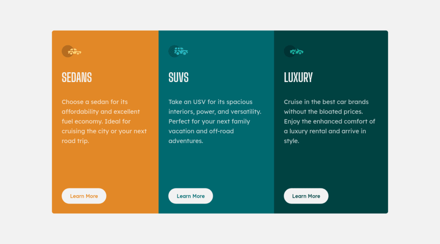
Hey everyone, this is my solution for this challenge and I'd like get all the feedback posible so I know I'm in the right direction. I've got a couple questions about this and the first one is about how can I make the learn more buttons stay in place when resizing between 900 and 1000 px, the paragraphs are not the same length so the distance between them and the the buttons is not always the same. And the second one is about vertical centering, as you can see in my last media query I've got a min-height 100vh and I heard that you should not set heights but is the only way I could think of to center the content when in desktop version of the component. Thank you.
Community feedback
- @BenConfigPosted over 3 years ago
Hey Julian,
You can add
margin-top: auto;on your buttons which will push them to the bottom of the containers, however this will only work if you have declared flex (or grid) on the containers.This should do the trick:
.col {
    display: flex;
    flex-direction: column;
}

button {
    margin-top: auto;
}
To answer your second point, it's totally fine to set
min-heighton anything. Settingheighthowever might cause overflow issues depending on how much content is inside the element.1@Julr09Posted over 3 years ago@BenConfig hey ben, thank you so much for the feedback and that little trick I made some changes and now it works as intended, I think it was the only thing missing and now it's done thanks to you.
1

Please log in to post a comment
Log in with GitHub
Join our Discord community
Join thousands of Frontend Mentor community members taking the challenges, sharing resources, helping each other, and chatting about all things front-end!
Join our Discord