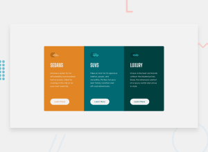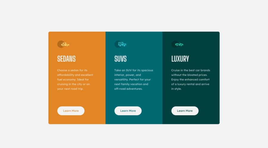
Design comparison
SolutionDesign
Community feedback
- @grace-snowPosted over 2 years ago
Hi
Make sure you match the background color of the design.
Viewing on mobile there is loads of margin at the top meaning I have to scroll down to see content, and the writing in the buttons is unreadably small for me
Marked as helpful1@grace-snowPosted over 2 years agoAccessibility-wise I'd recommend using h2s for this not h1s. If this was on a real page, there would be a h1 above this component.
I also think the learn more buttons should be anchor tags not button elements. What is it you'd expect to happen on click?
With css, you should
- not have the large padding-top: 10.6875rem; on body. That's what's causing the problem I mention above on mobile. No need for that. You can add a small amount of padding to the body of you want but that's only to ensure content can never touch screen edges
- the buttons should not have height or width. Use padding in em or rem instead
- the card and text should not have width or heights either. A max width on the cards or their wrapping element is fine, other than that leave them alone. Let the text wrap be handled by the width of the card.
- don't forget to always add obvious focus-visible styles to interactive elements so that keyboard users know where they are on the page. This should be clear, consistent and different to the hover style - usually a bold outline is the favoured focus-visible style.
Good luck
Marked as helpful1
Please log in to post a comment
Log in with GitHubJoin our Discord community
Join thousands of Frontend Mentor community members taking the challenges, sharing resources, helping each other, and chatting about all things front-end!
Join our Discord
