Design comparison
Community feedback
- P@Islandstone89Posted over 1 year ago
HTML:
-
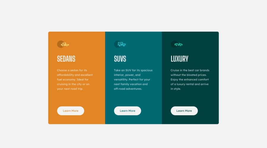
The icons are decorative, so the alt text should be empty:
alt="". -
There should only be one
<h1>on a page. Given there are 3 similar headings, I would change all of them into a<h2>. -
The headings should be written with normal capitalization. You then use
text-transform: uppercaseto change the capitalization in CSS. -
"Learn More" would navigate to another page, hence it is not a button but a link.
-
You don't need all the wrapping divs. Only add the elements that you need.
CSS:
-
Performance-wise, it's better to link fonts in the
<head>of the HTML then using@import. -
It's good practice to include a CSS Reset at the top.
-
Remove the
max-widthon.container. -
Remove everything except the
max-widthon.card. Themax-widthneeds some adjustment, though. Firstly, it should be in rem instead of px. And secondly, it is way too low. Change it to around70rem. -
Add
cursor: pointerto the "Learn More" links, so you get a "pointing hand" when hovering over them. -
Media queries need to be in rem, not
px. And I would adjust it to around80rem(equal to 800px). Keep thegridproperties, but remove thewidthandmax-width.
Marked as helpful0 -
Please log in to post a comment
Log in with GitHubJoin our Discord community
Join thousands of Frontend Mentor community members taking the challenges, sharing resources, helping each other, and chatting about all things front-end!
Join our Discord
