Not Found
Not Found
Not Found
Not Found
Not Found
Not Found
Not Found
Not Found
Not Found
Not Found
Not Found
Not Found
Not Found
Not Found
Not Found
Not Found
Not Found
Not Found
Not Found
Not Found

Submitted

3 column card preview using HTML SASS and JS

Marvin 130

@Marvin-Erazo

Desktop design screenshot for the 3-column preview card component coding challenge

This is a solution for...

  • HTML
  • CSS
1newbie
View challenge

Design comparison


SolutionDesign

Solution retrospective


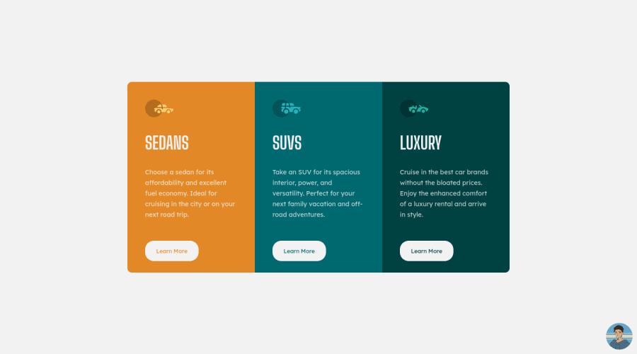
See my solution, click on the icon in bottom to see the element effect, and give me feedbacks please, thanks so much for all

Community feedback

T
Grace 29,310

@grace-snow

Posted

Hi again

You have the same issues with scss as your previous challenge here so definitely fix that

The button border radiuses don't quite match the design

The html is better but there are still some important changes needed

  • don't capitalise text in html, use css to change casing instead. Some screenreaders will read out capitalises html text as acronyms instead of reading thme word (so SUVs would be fine, SEDANS would not)
  • look up how and when to write alt text on images. These icons are decorative so should not have alt values like this. If they were meaningful images their alt would need to be a description of what the image looks like

Nice that you've tried to add a flourish to the attribution but if you do that it needs to be accessible. This is not.

  • clicks to toggle content would have to be on a button not a non-interactive element like an image
  • the button would need aria-expanded value to toggle
  • content would need aria-live attribute
  • content design would need to meet minimum color contrast ratio requirements
  • button would need hover AND an obvious focus-visible style (all interactive elements need this actually so that keyboard users know where they are on the page)

The js on this has been overcomplicated tbh. All it needs to do is toggle a class on click and toggle the aria expanded attribute once that's added to the button. There is no need for a counter.

It's also a common good practice to use querySelector with js- prefixed classes as the javascript element selectors instead of selecting by ID. Eg a class of js-author-toggle would tell any developer reading the html that there is some js behaviour on that element.

Marked as helpful

2

Marvin 130

@Marvin-Erazo

Posted

@grace-snow i recently read your last feedback, you're right, i try to fix it in other challenges, i want to be better. Can you help me with some pages about to do a accesible buttons? thanks so much for the feedback you're the best

0
Travolgi 🍕 31,420

@denielden

Posted

Hi Marvin, great work on this challenge! 😉

One tips for improve your code: instead of using px use relative units of measurement like rem -> read here

Also one Tip of graphic design: with font-family:" Big Shoulders Display ", cursive the browser will use the Comics Sans font when it doesn't find the first font indicated (you can seen during loading)... for the designer it's a really awful font! I would rather replace it with a font-family:" Big Shoulders Display ", sans-serif much more similar to the primary font.

Overall you did well 😁 Hope this help!

Marked as helpful

0

Marvin 130

@Marvin-Erazo

Posted

@denielden Tanks, i really didn't know this, Every day I learn something new. I will change that.

1
Vanza Setia 27,795

@vanzasetia

Posted

Hello, Marvin! 👋

Nice attribution! Also, nice work on this challenge! 🙌 Your solution is responsive and looks great! 👍

For the attribution, I would highly recommend using button element so that it is accessible by keyboard and screen reader users. Remember that any elements that have interactivity should always use interactive elements (e.g. button, a, etc).

In your CSS, I noticed this selector body .container .luxury-container which would be much be as .luxury-container . I would recommend only nesting when you want to style pseudo-elements, pseudo-classes (:hover, :focus, etc) and @media queries. It's a good practice to keep the CSS specificity as low and flat as possible. High specificity will make your stylesheet hard to maintain.

Alternative text for images should not contain any words that related to image (e.g. picture, photo, logo, icon, graphic, avatar, etc). It's already an image element so the screen reader will pronounce it as an image.

Also, the car icons are decorative images so, I would recommend leaving the alt="" empty and for the avatar, I would recommend putting your name as the alternative text of it.

I hope this helps! Keep up the good work! 👍

0

Marvin 130

@Marvin-Erazo

Posted

@vanzasetia I use SCSS because is more easy write code, but but i don't really know how to use it. I will wirte my code only in css an try to write more clean code, thanks so much for the feedback

0
Vanza Setia 27,795

@vanzasetia

Posted

@Marvin-Erazo You're welcome! You can improve the way you write by following Sass guidelines and don't worry too much about writing clean code. It comes with practice. 😁

0

Please log in to post a comment

Log in with GitHub
Discord logo

Join our Discord community

Join thousands of Frontend Mentor community members taking the challenges, sharing resources, helping each other, and chatting about all things front-end!

Join our Discord