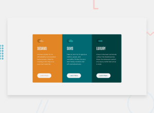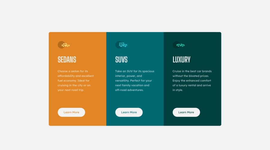
Design comparison
Community feedback
- @VCaramesPosted about 2 years ago
Hey there! 👋 Here are some suggestions to help improve your code:
-
Unless if your company requires you to use a library , I strongly suggest you stay away from using libraries until you fully grasp the fundamentals of HTML, CSS and JS. By using a library, you are robbing yourself from actually learning how to code.
-
To properly center your content to your page, you will want to add the following to your
Bodyelement (this method uses CSS Grid):
body { min-height: 100vh; display: grid; place-content: center; }-
The “car images/icons” in this component are purely decorative; They add no value. So their
Alt Tagshould be left blank and have anaria-hidden=“true”to hide them from assistive technology. -
The “SEDANS”, “SUVS” and “LUXURY” are headings so they need be wrapped in a Heading Element. Since each heading in this card has the same level of importance an
H2heading will be the best choice. -
Your "buttons" were created with the incorrect element. When the user clicks on the button they should be directed to a different part of you site. The
Anchor Tagwill achieve this.
If you have any questions or need further clarification, feel free to reach out to me.
Happy Coding! 🍂🦃
Marked as helpful0@iyaiyayo26Posted about 2 years ago@vcarames okay! thank you for the suggestions 👌
0 -
Please log in to post a comment
Log in with GitHubJoin our Discord community
Join thousands of Frontend Mentor community members taking the challenges, sharing resources, helping each other, and chatting about all things front-end!
Join our Discord
