Submitted over 1 year ago
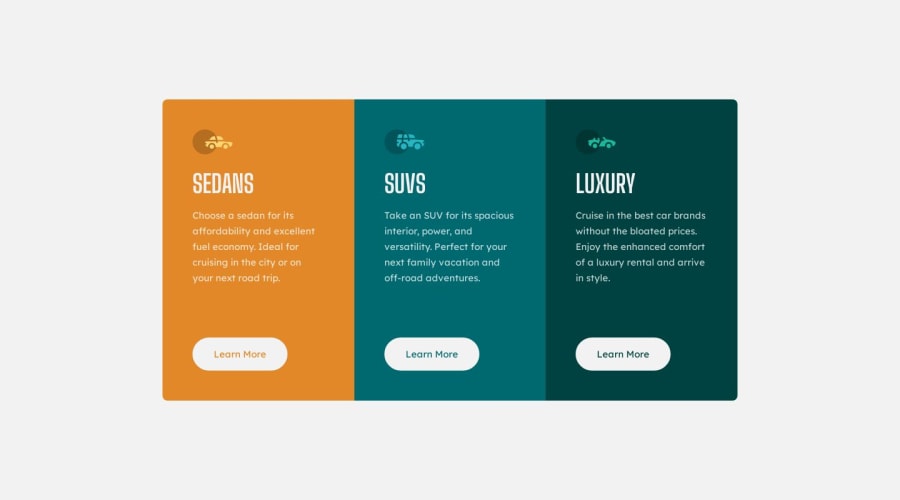
3 Column Card Layout using Flexbox and Sass
#sass/scss
@frontendstu
Design comparison
SolutionDesign
Solution retrospective
This was a fun little project. I actually really enjoyed building it and I am really happy with the final result.
I wasn't 100% what the breakpoint should have been. I did see that in the design it was 1440px. This seems way to big, in the end I opted for the breakpoint to be 1280px. What did everything else use?
Community feedback
Please log in to post a comment
Log in with GitHubJoin our Discord community
Join thousands of Frontend Mentor community members taking the challenges, sharing resources, helping each other, and chatting about all things front-end!
Join our Discord

