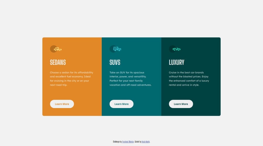
Design comparison
Community feedback
- @H-KeshkPosted 4 months ago
I having some problems with the result sizing; On my local device, the HTML output looks typically the same as the design's Pictures the project provides, but when I uploaded on Github and here, I found the sizes are not the same anymore!, The same problem when I switch between Chrome and Firefox.. This project is 99% percent the same as the design on my device, What should I do ?!
0@KapteynUniversePosted 4 months ago@H-Keshk I don't know about the chrome and firefox thing, maybe your width changing because of some side-bar or something but if you are talking about the difference between the solution and design preview above on this page, problem is you set
width: calc((100% / 3) - 9.65rem);to the cards. So without media query changes, cards will be around 250px at 1200px, 150px at 900px, 450px at 1800px etc. If your screen is small (it is around 1200px i think) it is normal to looks like the design but frontendmentor preview looks exactly at 1440px size.One way to fix it is giving body a max-width and margin auto i think
body {
max-width: 1440px;
margin-inline: auto; /* so it will horizontally center */
}
0
Please log in to post a comment
Log in with GitHubJoin our Discord community
Join thousands of Frontend Mentor community members taking the challenges, sharing resources, helping each other, and chatting about all things front-end!
Join our Discord
