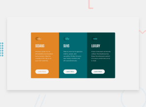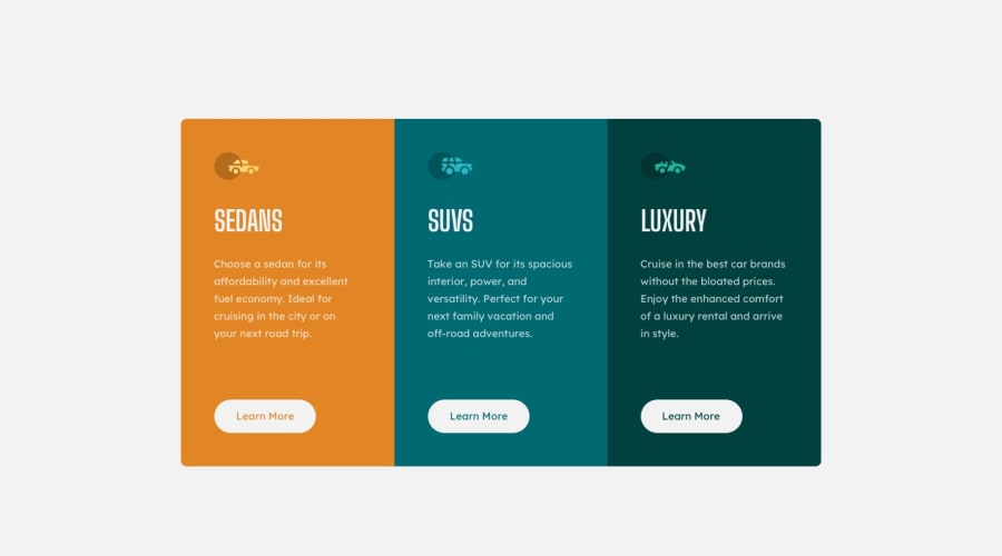
Design comparison
Solution retrospective
I would love to hear some feedback for this.
Community feedback
- @joelsalmeidaPosted over 3 years ago
Hi. You did a good job and with a few tweaks, it will be even better.
In the original design, the cards are a little narrower "Desktop version". Always make sure to check your project and the original design. "In all sizes"
Try adding "text-transform: uppercase" to your titles too.
Tip: I use "right-click > inspect" or "Ctrl + Shift + I" in Chrome. That way I can simulate the presentation of the website on computers, tablets, and mobile phones.
Hope this helps. Success!
0 - @palgrammingPosted over 3 years ago
you have your button state backwards they should be solid white with the text color of the cards and then when hovered go to the white outline and the white letters
0
Please log in to post a comment
Log in with GitHubJoin our Discord community
Join thousands of Frontend Mentor community members taking the challenges, sharing resources, helping each other, and chatting about all things front-end!
Join our Discord
