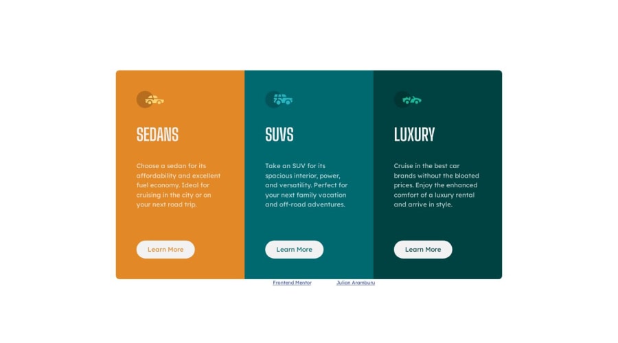
Design comparison
Solution retrospective
Questions:
- How can I improve this code?
- Is my code semantic enough?
- Is there a better way to use custom CSS Properties in this case?
  background-color: var(--clr-primary-1);
}

.car__type-2 {
  background-color: var(--clr-primary-2);
}

.car__type-3 {
  background-color: var(--clr-primary-3);
}
Community feedback
- @sircarloschavesPosted about 1 year ago
In my point of view, you could use utility classes in your project, despite it being a small component with little need for utility classes, but in the example you used above it would be a good choice.
Think with me:
-
The title of your card, in this case the type of car, is much smaller compared to the original design.
-
Think about the semantics of the card title, in a large project, what do you think the order of the titles would be? From my point of view, the title could easily be an
<h2>, because thinking about the structure of a landing page, it makes more sense to have a larger title for the section and then the subtitle. An example would be the section title:<h1>What type of car to choose?</h1>and then your cards with the subtitles<h2>Sedans</h2>, etc. But remembering that it's interesting not to use too many<h1>on your page, if it's a large project that already has a longer title at the beginning, it makes sense to use an<h2>for the title "What type of car to choose?" and use<h3>for car categories. -
To me it makes more sense for you to declare the font size in the body instead of in the
:rootelement. Doing it this way, you can useeminstead ofpx, because when you set the size of a paragraph1em, it will inherit from the parent element, which in this case will inherit one by one until it gets the size of15pxofbody. An even better way would be to setfont-sizein thehtmlelement, and then you would usereminstead ofemwhen defining font sizes.
Marked as helpful0@sircarloschavesPosted about 1 year ago@sircarloschaves Another thing I forgot to mention is that the
background-colorof thebodyiswhite, and in fact it should be the same color as the button color.0 -
Please log in to post a comment
Log in with GitHubJoin our Discord community
Join thousands of Frontend Mentor community members taking the challenges, sharing resources, helping each other, and chatting about all things front-end!
Join our Discord
