Submitted 11 months ago
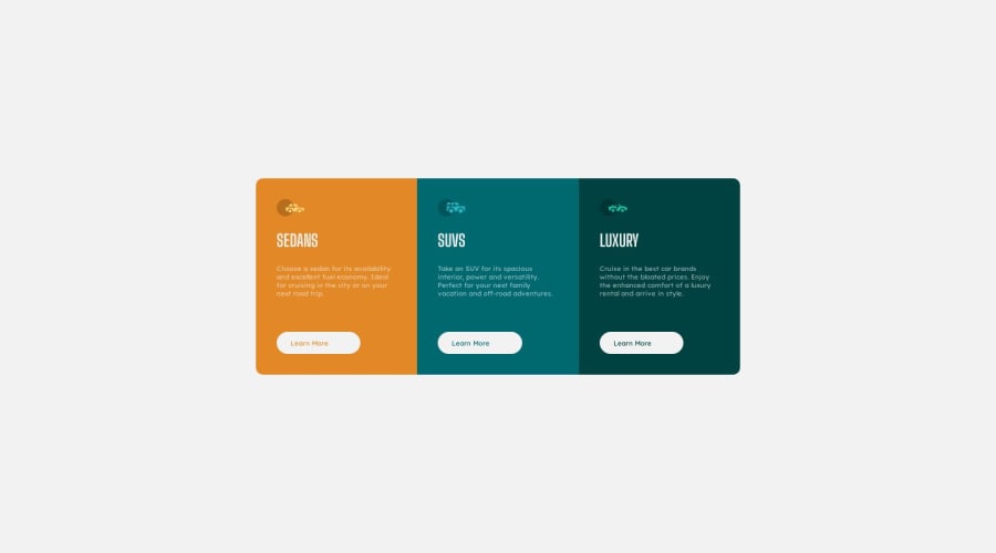
3 column card component using CSS GRID and FLEXBOX
@doniecodes
Design comparison
SolutionDesign
Solution retrospective
coded this on my mobile device. using the Acode editor app. i'd appreciate any feedback from anyone. Thanks!!
Community feedback
- @MelvinAguilarPosted 11 months ago
Hello there 👋. Good job on completing the challenge !
I have some suggestions about your code that might interest you.
HTML 🏷️:
- Use the
<footer>tag to wrap the footer of the page instead of the<div class="attribution">. The<footer>element contains information about the author of the page, the copyright, and other legal information.
- Not all images should have alt text. Car icons are for decoration purposes only, so they can be hidden from screen-readers by leaving its alt attribute empty. You can read more about this here 📘.
CSS 🎨:
- The fonts are too small; it's rarely a good idea to have fonts below 16px or 1rem. It makes reading the text difficult.
- Instead of using pixels in font-size, use relative units like
emorrem. The font-size in absolute units like pixels does not scale with the user's browser settings. Resource 📘.
I hope you find it useful! 😄 Above all, the solution you submitted is great!
Happy coding!
Marked as helpful1@doniecodesPosted 11 months agoHello @MelvinAguilar .THANK YOU SO MUCH for that { i really appreciate it: 100%; }
0 - Use the
- @danielmrz-devPosted 11 months ago
Hello @DonieCode!
Great solution for a project coded on a mobile device 😁
0
Please log in to post a comment
Log in with GitHubJoin our Discord community
Join thousands of Frontend Mentor community members taking the challenges, sharing resources, helping each other, and chatting about all things front-end!
Join our Discord
