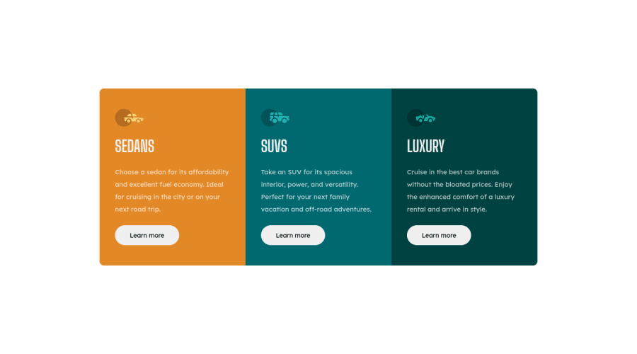
Design comparison
SolutionDesign
Solution retrospective
Hey guys, please let me know where i should improve my css spaghetti code, any criticism and tips are welcome. Thanks you so much
Community feedback
- @sarahc-devPosted about 3 years ago
Hey! This looks good - I wouldn't say you have spaghetti code at all!
- Using h1 instead of h2 in this instance would stop the accessibility report shouting at you - you wouldn't typically have more than one h1 - but in this design where the 3 main headers are of equal importance it doesn't cause a html error I don't believe.
- Use rem for your font sizes instead of px for better accessibility (allows a user to set browser to a larger font). But if you do this, you also largely need to set heights and widths if using in rem or em so everything's container can also grow if font is set to large.
- I wouldn't use justify-content: space-around to create the spacing between the text - i have a thin screen and everything gets squashed for me. Better to use padding or margins to ensure the space is always there on different screen sizes.
Hope that helps :)
0
Please log in to post a comment
Log in with GitHubJoin our Discord community
Join thousands of Frontend Mentor community members taking the challenges, sharing resources, helping each other, and chatting about all things front-end!
Join our Discord
