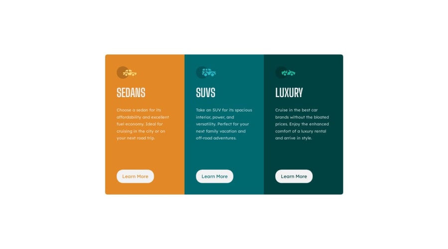
3 Column Card Component / HTML and CSS
Design comparison
Solution retrospective
After finishing I feel that I wrote more code than was necessary, maybe I didn't use classes in an effective way but otherwise I feel the result was OK.
(again I had difficulties with widths and margins without Figma files)
Feedbacks are welcome.
Community feedback
- @0xabdulkhaliqPosted over 1 year ago
Hello there 👋. Congratulations on successfully completing the challenge! 🎉
- I have other recommendations regarding your code that I believe will be of great interest to you.
CSS 🎨:
- Looks like you declared each background color for each button which needs to be change the background color during the hover, actually we can handle that issue with a css color function named
rgba()
- The
rgba()
function define colors using the Red-green-blue-alpha (RGBA) model. RGBA color values are an extension of RGB color values with an alpha channel, which helps us to take control over the opacity of the color.
- So just add
rgba(0,0,0,0)
for thebutton
elements duringhover
- Let's look an example
button:hover { background-color: rgba(0,0,0,0); color: white; outline: 1px solid white; }
- Now you can remove these individual declarations for the background for each
button
element
.sedans button:hover { background: var(--orange); color: var(--gray); border: 1px solid var(--gray); cursor: pointer; } .suvs button:hover { background: var(--blue); color: var(--gray); border: 1px solid var(--gray); cursor: pointer; } .luxury button:hover { background: var(--darkblue); color: var(--gray); border: 1px solid var(--gray); cursor: pointer; }
- Now you have gotten the desired result without hassling in an efficient way.
- Pro tip: you can use
transparent
value forbackground
property to get the same effect asrgba(0,0,0,0)
but usingrgba
provides more granular control over the color correction.
.
I hope you find this helpful 😄 Above all, the solution you submitted is great !
Happy coding!
Marked as helpful0 - @hitmorecodePosted over 1 year ago
Congratulations well done. Yes your CSS can be shorter
<section class="card-info sedans"> <div class="img"> <img src="images/icon-sedans.svg" alt=""> </div> <div class="content"> <h1>Sedans</h1> <p> Choose a sedan for its affordability and excellent fuel economy. Ideal for cruising in the city or on your next road trip. </p> <button class="btn btn-sedan">Learn More</button> </div> </section>
.card { display: flex; align-items: center; ### you can remove this justify-content: center; ### you can remove this }
For the sections you have repeated the same thing three times. You can avoid this by adding an extra class to the section. I'm naming it card-info, you can name it whatever you want. Add this class to all sections and you can remove everything that it's the same.
.card-info { max-width: 17rem; height: 30rem; padding: 2.5rem; } .sedans { background: var(--orange); border-radius: 7px 0 0 7px; } .suvs { background: var(--blue); } .luxury { background: var(--darkblue); border-radius: 0px 7px 7px 0px; } .btn { text-align: center; padding: 12px 18px; border-radius: 20px; border: 1px solid var(--gray); margin-top: 2rem; background-color: var(--gray); transition: all 0.3s } .btn-sedan { color: var(--orange); } .btn-suv { color: var(--blue); } .btn-luxury { color: var(--darkblue); } ### do this for the rest of the buttons .btn-sedan:hover { color: var(--gray); backgroud-color: var(--orange); }
Marked as helpful0
Please log in to post a comment
Log in with GitHubJoin our Discord community
Join thousands of Frontend Mentor community members taking the challenges, sharing resources, helping each other, and chatting about all things front-end!
Join our Discord