Design comparison
SolutionDesign
Solution retrospective
Any feedback will be welcome
Community feedback
- @Shalom2935Posted over 1 year ago
Hey these are some advices :
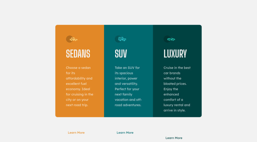
- There is no need to create two classes container and flex for the main element one will be enough.
- After defining the width of .card, there is no need to give as well the width of his children instead add a flex property and set it at 1 so they will equally share the avaible space. Remove as well the height or set it to auto.
Marked as helpful1@AliTheCoder123Posted over 1 year ago@Shalom2935 what flex property
if I remove container or flex it doesn't work
0@Shalom2935Posted over 1 year ago@AliTheCoder123 That is surely because while removing it you didn't rewrite the properties you just deleted in the .container. flex property helps you define 3 properties: the flex-grow, flex-shrink and flex-basis. So when you set it at 1, what you're saying is that whether the container's width is increased or decreased, the children will always have the same width which is 1/3 of the parent's width.
Marked as helpful1
Please log in to post a comment
Log in with GitHubJoin our Discord community
Join thousands of Frontend Mentor community members taking the challenges, sharing resources, helping each other, and chatting about all things front-end!
Join our Discord
