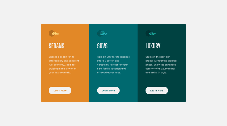
Design comparison
Solution retrospective
Any Feedback is Appreciated.
Thank you.
Community feedback
- @vanzasetiaPosted over 2 years ago
Hi there! 👋
Nice work on this challenge! It's great that the site is using the Normalize and all the page content lives inside a landmark! 👍
However, there are some things that can be improved.
- The icons are decorative images which means that if those icons don't exist then there will be no missing information. So, I suggest leaving the
altempty so that the screen reader users won't have to listen to the unrelated content. - I highly recommend using
remor sometimesemunit instead ofpxto make sure that everything can scale properly according to user needs. Usingpxwill not allow the users to control the size of the page based on their needs.
I hope you find this information beneficial. Happy coding! 😄
Marked as helpful0@GSD3v08Posted over 2 years ago@vanzasetia Thank you very much for your feedback, I'll use more often rem and em units in next projects, getting used to them it's a little difficult at first and some times I forget to use them.
0@vanzasetiaPosted over 2 years ago@GSD3v08 You're welcome! 😄
Take it step by step, maybe at first you want to only use
remfor allfont-sizeand after that, start using it onmarginandpadding, and until you've managed to useremas your main unit instead ofpx.Hope my tips help!
0 - The icons are decorative images which means that if those icons don't exist then there will be no missing information. So, I suggest leaving the
Please log in to post a comment
Log in with GitHubJoin our Discord community
Join thousands of Frontend Mentor community members taking the challenges, sharing resources, helping each other, and chatting about all things front-end!
Join our Discord
