

Design comparison

Solution retrospective
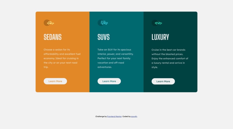
Another challenge done.
I am not sure if is it good practice to set min-height: 40% to description container to keep distance between button and text od wider screens.
Feedback and tips are welcomed :D
Please log in to post a comment
Log in with GitHubCommunity feedback
- @NehalSahu8055
Hello Coder 👋.
Congratulations on successfully completing the challenge! 🎉
Few suggestions regarding design.
-
You forget to add
cursor: pointer;on buttons. It will be more user-friendly to add it. -
Follow
semantics ruleplacefooteroutside and below the main tag -
For image like
.svg are decorativewhich browser will not render it to be important and skip it, so it make no sense to addaltleave itblank.
<img src="image.svg" alt="">- Try to add
accessibility featureslike aria, sr-only, title.
aria : link
.sr-only:link
I hope you find this helpful.
Happy coding😄
Marked as helpful -

Join our Discord community
Join thousands of Frontend Mentor community members taking the challenges, sharing resources, helping each other, and chatting about all things front-end!
Join our Discord