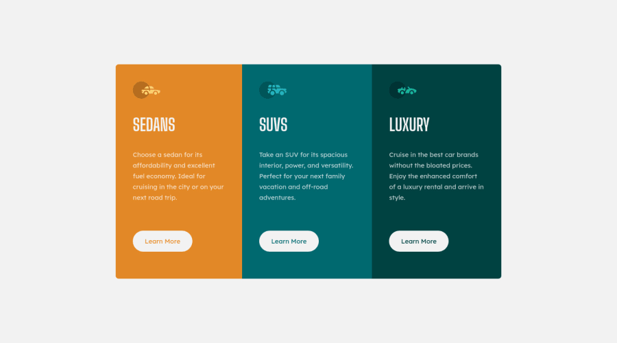
Design comparison
Solution retrospective
Curious about best practices for responsive design. Should I have made my flexbox scale to viewport size, or is setting a fixed scale for certain viewports via media queries fine? Would love any general feedback as well, I'm just beginning to learn!
Community feedback
- @ChamuMutezvaPosted over 3 years ago
idare unique , you cannot use the same id on another element . Use class instead. This<button id=#sedan_button>Learn More</button>has been used several times.- an inline element
spancannot be a parent to block elementspandheadings. Use a div on the place of a span. - what is the purpose of the following media query? It might be a typo , maybe you wanted to use
max-width
@media screen and (max-height:500px) { main { min-height: 500px; } }-
i would encourage you to look into mobile first design , where your base styles is for mobile and the media queries use
min-width. Generally , you use less code with mobile first -
well done on your first project
Marked as helpful1 - @jmgiselePosted over 3 years ago
Thank you!! I just updated my code to fix the issues you brought up. The media query for a max-height of 500px was so that the footer containing the frontend mentor didn't overlap with the main content when the viewport was smaller than 500px. Without this query on screens of under 500px height (rare, I realize...) the footer overlapped with the main content rather than being pushed below it.
0
Please log in to post a comment
Log in with GitHubJoin our Discord community
Join thousands of Frontend Mentor community members taking the challenges, sharing resources, helping each other, and chatting about all things front-end!
Join our Discord
