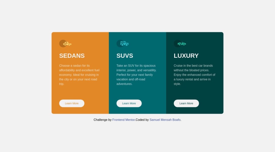


Design comparison

Solution retrospective
I used flex to design this frontend. It took me 3 hours to complete this and I must say I see progress. Thanks to frontendmentor.io for providing us with this challenges.
Community feedback
- @rohitd99Posted over 1 year ago
Hi Samuel
Congrats on completing the challenge.
A few changes to the style of body tag to make it centered:
margin: 1rem 2rem;
display: flex;
justify-content: center;
flex-direction: column;
min-height: 100vh;
align-items: center;
these changes will make your body tag expand as per need and keep the content centered whilst providing a margin. Also instead of having flex wrap on your cards div, you can use the following properties inside of a media query such as
@media (max-width : 780px)
{
.card{
flex-direction: column;
}
}
flex-wrap made the cards wrap on each other at tablet sizes which made the cards look weird so instead you can add this so that they go into a single column.
Happy coding
Marked as helpful0

Please log in to post a comment
Log in with GitHub
Join our Discord community
Join thousands of Frontend Mentor community members taking the challenges, sharing resources, helping each other, and chatting about all things front-end!
Join our Discord