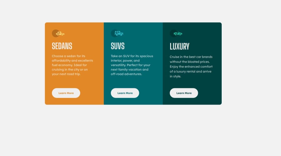
Design comparison
Solution retrospective
I’m most proud of creating a responsive, user-friendly interface that significantly improved user engagement
What challenges did you encounter, and how did you overcome them?Initial deployments can lead to unexpected errors. I learned to implement automated testing and continuous integration pipelines to catch issues before they reach production.
What specific areas of your project would you like help with?JavaScript's
Community feedback
- @SvitlanaSuslenkovaPosted about 1 month ago
body { display: flex; flex-direction: column; justify-content: center; align-items: center; min-height: 100vh; } Try this to align(top-bottom) and justify(left-right) your project to the center. It applies to the parent component(body), don't forget about !!min-height!!. You can use grid instead of flex too.
Marked as helpful0@Black1ukPosted about 1 month agothank you so much, really appreciate @SvitlanaSuslenkova
0
Please log in to post a comment
Log in with GitHubJoin our Discord community
Join thousands of Frontend Mentor community members taking the challenges, sharing resources, helping each other, and chatting about all things front-end!
Join our Discord
