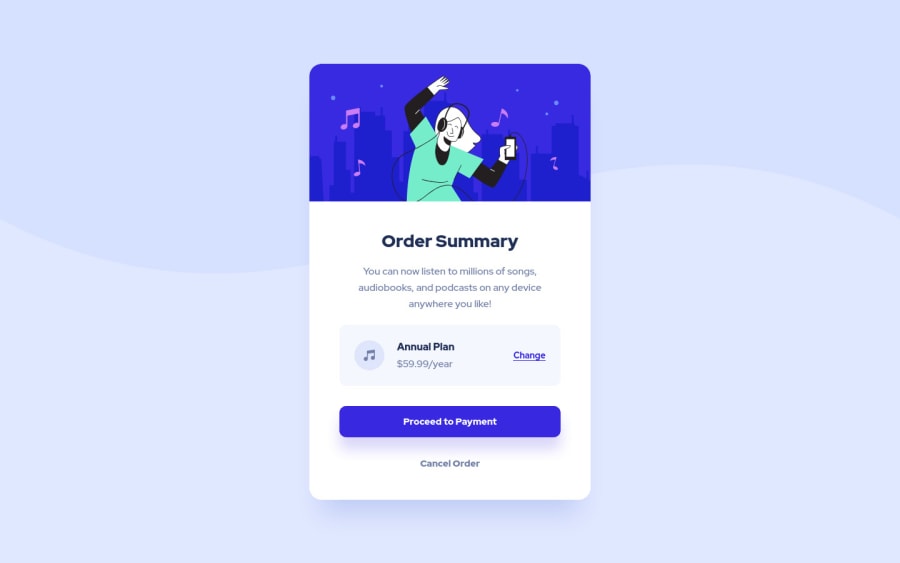
Design comparison
Solution retrospective
Hi everyone, I really spent a lot of time on this but I couldn't finish it, so I gave up... Maybe I should focus on some specific topics like responsive design... However, this project improved my coding skills a lot. I feel that.
I have two problems here: 1 - How can I make this project responsive? Should I change every element or just some container elements? I couldn't understand it.
2 - How can I use .svg files as a background image? This topic is totally new for me. I checked some resources on the internet but I don't understand them.
Until I finished my code, I changed my main structure a lot. I still have a problem with my nested structure and class names in HTML.
I'll wait for some good responses from the community like my first project. They're so beneficial to me. Thank you so much.
Community feedback
Please log in to post a comment
Log in with GitHubJoin our Discord community
Join thousands of Frontend Mentor community members taking the challenges, sharing resources, helping each other, and chatting about all things front-end!
Join our Discord
