Design comparison
Solution retrospective
Hi everyone, here is my 2nd challenge on this site! Don't hesitate if you have any advice or the like, or if something has been "done" wrong!
Thanks in advance, and have a good day / week!
Community feedback
- @mattstuddertPosted about 4 years ago
Hey Florian, you've done an awesome job on the challenge. Great work! 👍
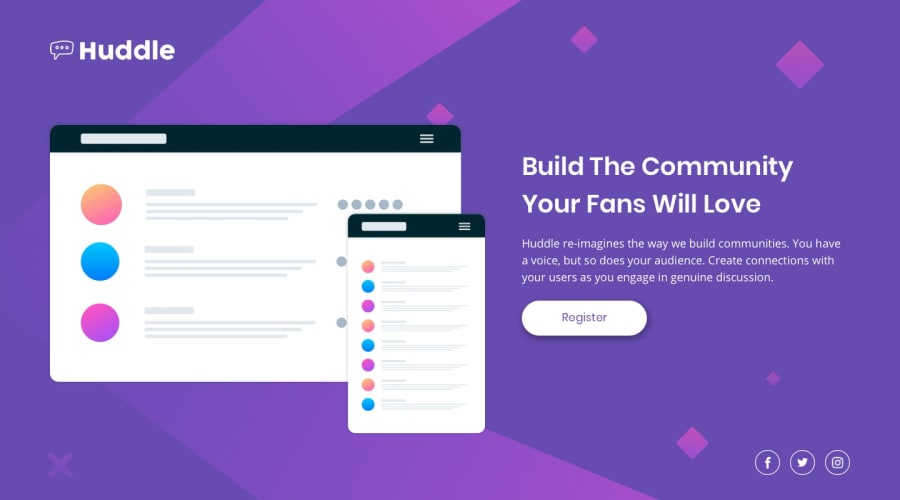
Your solution matches up to the design nicely and your mobile layout looks great. The only two small areas I'd recommend reviewing would be:
- When you first switch from mobile to the desktop layout, the text looks very squashed. I'd recommend reducing the size of the image on the left initially to make more space for the text.
- The
alttext in the social link images will be read out to people using screen readers. So I'd recommend adding more descriptive text. For example, "facebook link" could be changed to "Follow us on Facebook". Making that change would add much more context to screen reader users.
Keep up the great work. I hope you enjoyed the challenge! 🙂
2@FloPereira75Posted about 4 years ago@mattstuddert
Thank you for your advice! It motivates me even more! And for the "alt" thank you for the advice, I never really understood if I had to be precise or not haha! Huge thank you, I'm going to make myself a "newbie" challenge in HTML / CSS and then I will attack a challenge with JS!
And yes, this site is great, that's what I needed to be able to really progress, really cool!
0@mattstuddertPosted about 4 years ago@FloPereira75 you're welcome! I look forward to seeing your future solutions!
1
Please log in to post a comment
Log in with GitHubJoin our Discord community
Join thousands of Frontend Mentor community members taking the challenges, sharing resources, helping each other, and chatting about all things front-end!
Join our Discord
