Design comparison
Solution retrospective
As the title says, I have been learning for a couple of weeks and really looking for any advice and criticism that can further my development.
Any feedback is hugely appreciated.
Please log in to post a comment
Log in with GitHubCommunity feedback
- @codeswithroh
Considering you have done this by learning only 2 weeks is great. Now, after checking out your code I would like to suggest you one tip and that is to use grid. You have used too much flex and don't get me wrong I love using flex too but in these type of scenarios, grid helps a lot. Also, your mobile-responsiveness is good but when checked in tablets, the texts spills over one another. In order to avoid that play a little with grid or a quick fix would be to use the padding wisely. Like for example, instead of using the padding you have given in your <header> tag try using "padding:3em 10em 0 0;" and you will see the spilling of the header part is solved.
By the way, I also started a month ago and am enjoying it since then, hope you are loving it as well. Happy coding :)
- @fraserwat
-
Quick fix would be to add alt text to all your images. Not visible to the naked eye but makes a huge difference to people with accessibility issues, using screen readers etc (I think it also might be useful for SEO, but I could be wrong there?). As simple as
alt="description of image"in the HTML element. -
You probably don't need that middle @media query, it can just be collapsed into the mobile view.
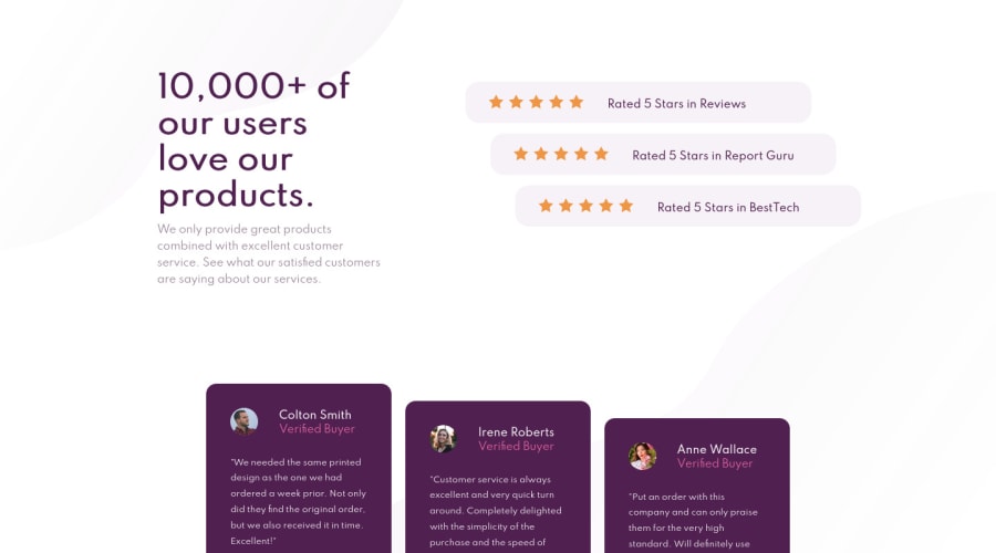
Theres a couple of small cosmetic differences to make it more like the original. Header could be wider and the text in it bolder, testimonial boxes can take up more of the screen. But aside from that you've got it sorted!
-
Join our Discord community
Join thousands of Frontend Mentor community members taking the challenges, sharing resources, helping each other, and chatting about all things front-end!
Join our Discord
