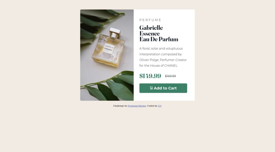
Design comparison
Solution retrospective
I'm a newbie, there's in some code that I'm sure but I'm happily accepting any suggestion and negative feedback to improve my webeev
Community feedback
- @NaleekaPosted about 2 years ago
Hi @melco10 👋,
Use "alt" attribute and describe the image every time you using the
<Img>tags<img src="images/image-product-desktop.jpg" alt="add to cart icon" class="product-img" aria-hidden="true">Happy coding 👨🚀
Marked as helpful0 - @mcddcmPosted about 2 years ago
Hey @melco10 - good effort with the challenge! You've done great to get so close to the original design.
I would say you can explore using em, rem and % values instead of px values for font sizes, widths, heights, margin, padding, etc to make your future projects more responsive. You should also avoid inline styling and keep your all CSS in your .css file(s), if possible.
You can also check the 'Report' page where you can find useful information on HTML validation issues with the page.
I'm sure some more experienced people here will give you more constructive feedback than I can.
Keep up the good work!
Marked as helpful0
Please log in to post a comment
Log in with GitHubJoin our Discord community
Join thousands of Frontend Mentor community members taking the challenges, sharing resources, helping each other, and chatting about all things front-end!
Join our Discord
