


Abdul Khaliq 🚀• 72,620
@0xabdulkhaliq
Posted
Hello there 👋. Congratulations on successfully completing the challenge! 🎉
- I have other recommendations regarding your code that I believe will be of great interest to you.
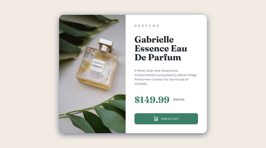
PiCTURE TAG 📸:
- Looks like you're currently using single image for both Desktop & Mobile devices, but we want to swap images according to their screen sizes. Luckily there's a native html element which may help us to achieve this method without need of css
- So let me introduce the
pictureelement.
- The
<picture>tag is commonly used for responsive images, where different image sources are provided for different screen sizes and devices, and for art direction, where different images are used for different contexts or layouts.
- Example:
<picture>
   <source media="(max-width: 768px)" srcset="small-image.jpg">
   <source media="(min-width: 769px)" srcset="large-image.jpg">
   <img src="fallback-image.jpg" alt="Example image">
</picture>
- In this example, the
<picture>tag contains three child elements: two<source>elements and an<img>element. The<source>elements specifies different image sources and the conditions under which they should be used.
- Using this approach allows you to provide different images for different screen sizes without relying on CSS, and it also helps to improve page load times by reducing the size of the images that are served to the user
- If you have any questions or need further clarification, you can always check out
my submissionand/or feel free to reach out to me.
.
I hope you find this helpful 😄 Above all, the solution you submitted is great !
Happy coding!
1
