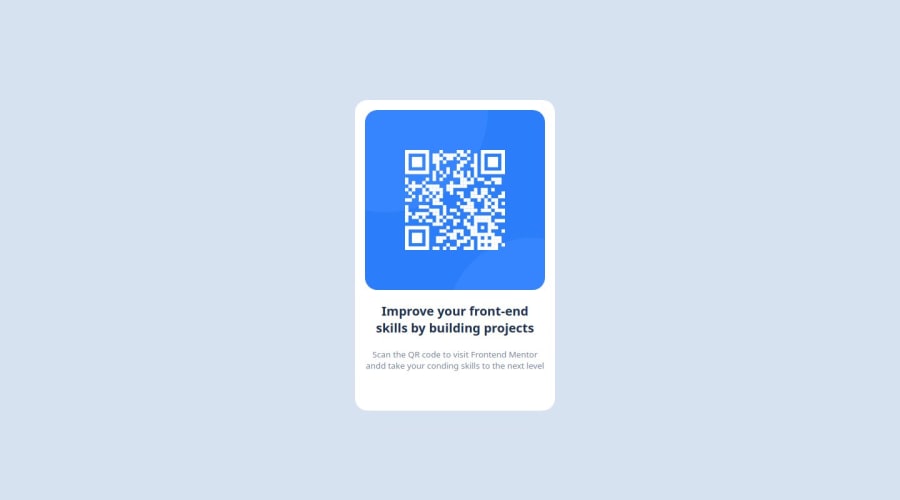
1st challenge solution (QR code component), using CSS Grid and Flexbox
Design comparison
Solution retrospective
Well, it was a very simple problem, so I don't think there's much room for improvement. Overall, I'd say that I could keep an eye on accessibility principles, since I'm aware of none of them. I'm not sure if I used the correct HTML semantic tags for the job, so that would, maybe, be something I'd change.
What challenges did you encounter, and how did you overcome them?None
What specific areas of your project would you like help with?I used a tag for the bottom text, but I'm not sure if that was a good decision. Also, In order to align the QR code image, I used a wrapping for the job, but probably I could've centered the , in the top section, without using an extra .
Community feedback
- @gdsimoesPosted about 1 year ago
It looks pretty good and if you use the
box-shadowit will look even better!Also, you might consider using a separate CSS file. It won't change the final website but makes for a better developer experience.
2
Please log in to post a comment
Log in with GitHubJoin our Discord community
Join thousands of Frontend Mentor community members taking the challenges, sharing resources, helping each other, and chatting about all things front-end!
Join our Discord
