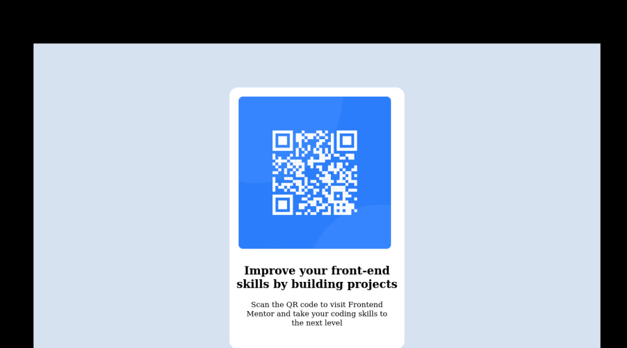
Design comparison
Solution retrospective
All feedback is welcome
Community feedback
- @correlucasPosted over 2 years ago
👾Hello Taiwo, congratulations for your first solution!👋 Welcome to the Frontend Mentor Coding Community!
I've just opened your live site and I can say that you did a great job putting everything together! There's some tips to improve your solution:
You've done the design for the wrong image, when you download the starter files the folder comes with 3 files (preview card, desktop and mobile) you've created the solution based on the
previewand you should consider only themobile + desktop images.Remove the
background-colorfrom the container and add it to thebodyto make sure this color background will display it full screen.Note that for this challenge all you need is a single block to hold all the content, can be
<div>or<main>if you want to use a semantic tag to wrap the content, the cleanest structure for this challenge is made by a block of content with div/main and all the content inside of it (img, h1 and p) without need of any other div or something. See the structure below:<body> <main> <img src="./images/image-qr-code.png" alt="Qr Code Image" > <h1>Improve your front-end skills by building projects</h1> <p>Scan the QR code to visit Frontend Mentor and take your coding skills to the next level</p> </main> </body>✌️ I hope this helps you and happy coding!
Marked as helpful0 - @romila2003Posted over 2 years ago
Hi Taiwo,
Welcome to the frontend mentor community and congratulations for 🎉 for completing your first challenge, the card looks great. There are some issues/suggestions I want to address:
- It is best practice to wrap the main content within the
maintag which would ensure that your content is wrapped within the correct landmarks e.g.<main class="container"></main> - Instead of using the
backgroundproperty, you can use thebackground-colorproperty used in thesectiontag onto the body. - I would highly suggest not to use too many margins and to center the card, you can use the
flexproperty instead e.g.
body {
  display: flex;
  align-items: center;
  justify-content: center;
  min-height: 100vh;
}
Also, you used a lot of tags which can be reduced significantly to look something like this:
<main class="container">
   <img src="image-qr-code.png" alt="qr-code">
   <div class="text-content">
      <h1>Improve your front-end skills by building projects</h1>
      <p>Scan the QR code to visit Frontend Mentor and take you coding skills to the next level</p>
   </div>
</main>
Since this project does not require making any responsive changes, you do not need to use media queries, instead you can use the
max-widthproperty instead e.g..container { max-width: 350px; width: 100%; } body { margin: 0 10px; }I included the
marginproperty on the body so that the card does not touch the side of the screen.Overall, great attempt and wish you the best for your future projects so keep coding 👍.
Marked as helpful0 - It is best practice to wrap the main content within the
- @hyrongennikePosted over 2 years ago
Hi @fawzab,
Good job on the challenge just few suggestions.
Make the following change to the body rule.
body {
    /* background: #000; */
    /* background-position: center; */
    background-size: cover;
    min-height: 100vh;
    background-color: hsl(212, 45%, 89%);
    display: flex;
    justify-content: center;
    align-items: center;
}
make the following changes to the section.
section {
    max-width: 1440px;
    /* height: 800px; */ **remove**
    /* border: 1px solid hsl(212, 45%, 89%); */ **remove**
    /* margin: 100px auto; */ **remove**
    /*background-color: hsl(212, 45%, 89%);*/ **remove**
}
also make the width of the card 375px on mobile. hope this is helpful.
Marked as helpful0
Please log in to post a comment
Log in with GitHubJoin our Discord community
Join thousands of Frontend Mentor community members taking the challenges, sharing resources, helping each other, and chatting about all things front-end!
Join our Discord
