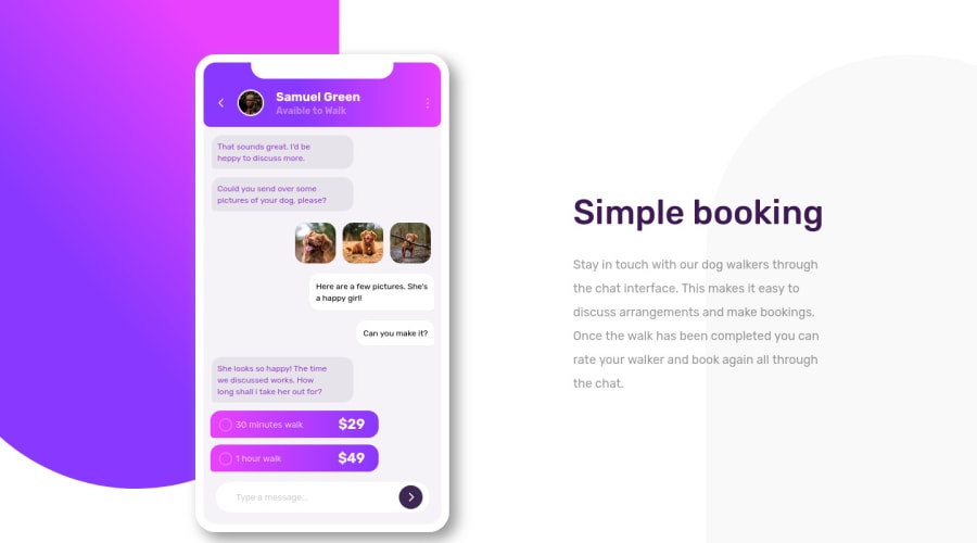
Design comparison
Solution retrospective
All feedbacks are welcome!
Community feedback
- @BilalSalmiPosted about 2 years ago
Hi FrostLordV, your design is so awsome!
- All you need to do for optimizing your design is to minimize the phone image a little bit.
that is . now let's move on to fix your accessbility report issues.
Heading levels should only increase by one
It looks like you forget to use <h4> in your page.
alt attribute
read more about images and alt attribute here.
Consider to use alt attribute which stand for alternative text , this text will appear if for any reason browser can't load your image, as well as it used by screen readers and google.
All page content should be contained by landmarks
Consider to use html semantic elements such as <section> <article> < aside> < header> <footer> and <main> .
The <main> should exist only once in your page.
read more about html semantic here.
that's all, keep it up!
Marked as helpful1
Please log in to post a comment
Log in with GitHubJoin our Discord community
Join thousands of Frontend Mentor community members taking the challenges, sharing resources, helping each other, and chatting about all things front-end!
Join our Discord
