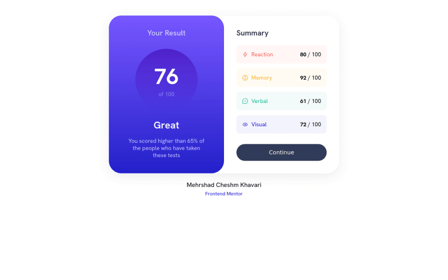
Design comparison
Solution retrospective
Things that I had problem with (I appreciate your help for that) 1- First of all I don't know why I couldn't put the main div at the center with margin: 0 auto; . I used this property all the time to put the main div at the center of the body but it didn't work. So I had to put it at the center using margin myself.
2- Another problem is the corner borders of the 4 boxes in right. I searched a lot for it, multiple linear-gradients, svgs and many other ways were the solutions but I couldn't figure out any of them!
3- Also I wanted to put transtiton for the "continue" button but it seems that background-image doesn't take transtion so I couldn't find a way for transtitioning my button from the state color to the gradient color while hovored.
Community feedback
- @heisemmaco-devPosted over 1 year ago
hello, you really tried in the design layout, you can use "display: grid;" as property in the body selector, then, use this property "place-contain: center;" still in the body selector to center your div contain and secondly i see that u use div to all your content, i will recommend you to use tags like "article" "section" for a responsive website. sorry i don't understand your second question, i hope you find this useful
Marked as helpful0@MehrshadHeisenberg3Posted over 1 year ago@Moderateemmaco
Thanks for looking at my design. I really tried it to be like the design in frontend mentor. You are right, I forgot using article and I just used div and that's because I thought that it's not a complete website. But you are right and I will use better tags next time.
My second question is about the right part of the design, the SUMMARY part. There is only one difference between my design and the design in frontend mentor. If you look at the boxes of the design in frontend mentor you will see some borders on the boxes of the SUMMARY part.
But these borders are ONLY at the corners, I wasn't able to build those borders because they are only at the corner.
And again thanks for replying on my design.
0@heisemmaco-devPosted over 1 year ago@MCKH03
ok, i now understand, you mean a those border edges right, you can do it when you wrap it with a div or section then add color to the background like this:
<div class="the_edge_border"> <setection class="the box">i couldn't complete the markup but you can add background-color to the "the_edge_border" after the inner wrap, if you do understand, you can chat me on twitter @heisemmaco so will explain better don't know the right word to use
0
Please log in to post a comment
Log in with GitHubJoin our Discord community
Join thousands of Frontend Mentor community members taking the challenges, sharing resources, helping each other, and chatting about all things front-end!
Join our Discord