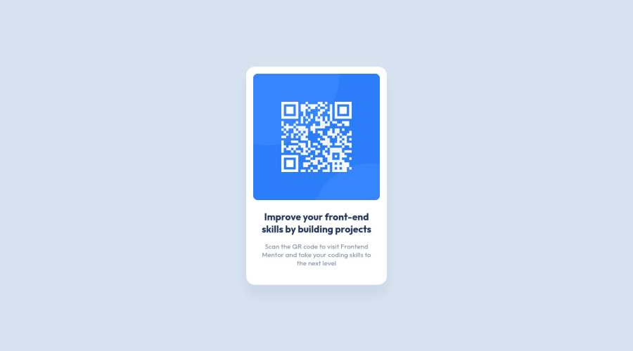
Design comparison
Solution retrospective
I've changed my very first project according to some good advice. This time, I can't understand why my text area is higher than the design file's text area. I checked my elements positions and they are in the same positions as the figma files. What should I do? Thanks.
Also, are the nested structure of the semantic containing elements and BEM notation correct?
Thanks again.
Community feedback
- @rostyslav-nazarenkoPosted almost 2 years ago
Hi again!
Mostly the same issues read my comment on your previous challenge.
I noticed only one thing. Don't set width and height to card element. Right now it is completely fine because you have a fixed font size and a card with a fixed size. But later on, when you will work on bigger challenges or projects it might create problems, like overflows, text on top of another text. As a quick fix, use
rem
units forwidth
and don't useheight
at allMarked as helpful1 - @MelvinAguilarPosted almost 2 years ago
Hello there ๐. Good job on completing the challenge !
I have some suggestions about your code that might interest you.
HTML ๐:
- Figure elements (
<figure>
) should only be used when captions are required with<figcaption>
, you can directly use the image tag in this solution.
Alt text ๐ท:
-
The
alt
attribute should explain the purpose of the image. Uppon scanning the QR code, the user will be redirected to the frontendmentor.io website, so a betteralt
attribute would beQR code to frontendmentor.io
If you want to learn more about the
alt
attribute, you can read this article. ๐.
CSS ๐จ:
- The images have a default bottom space of around 3px, you can remove it using
display: block
on the image, which might be why it's not exactly the same as the Figma. Even so, it's a very similar solution to the designs.
-
The issue with the BEM naming convention in your code is that the block name (or the top-level element) is missing and the class names "qr-code__img-area" and "qr-code__text-area" do not have a block name to indicate which component or feature they belong to.
In this case, the class name should be like this:
qr-code qr-code__img-area qr-code__text-area
I hope you find it useful! ๐ Above all, the solution you submitted is great!
Happy coding!
Marked as helpful1 - Figure elements (
Please log in to post a comment
Log in with GitHubJoin our Discord community
Join thousands of Frontend Mentor community members taking the challenges, sharing resources, helping each other, and chatting about all things front-end!
Join our Discord