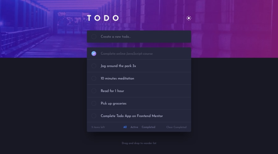
Design comparison
Solution retrospective
The layout and styling were very straightforward, though figuring out which color corresponded to which element when setting up the variables was annoying as hell. The javascript for this was also pretty straightforward (I already knew a couple of ways of creating to-do lists). The most difficult part of course was making the items/tasks draggable and sortable; had to learn from a couple of videos and then I experimented with what I learned to see what else I could do or if there were any other ways to achieve the desired functionality, so that ate up a few hours of my time.
I also made sure to write what I think is very clear code, at least for the JS part, so that anyone who looks at it can quickly understand what everything does. There are comments all throughout the file. Hope someone finds it useful!
PS: because the default items on the list are intended to guide the user into testing out the functionality, I did not add a localStorage feature to the JS, as any changes the users make to the list could result in deleting the original items. Therefore, changes to the list are not saved.
Community feedback
Please log in to post a comment
Log in with GitHubJoin our Discord community
Join thousands of Frontend Mentor community members taking the challenges, sharing resources, helping each other, and chatting about all things front-end!
Join our Discord
