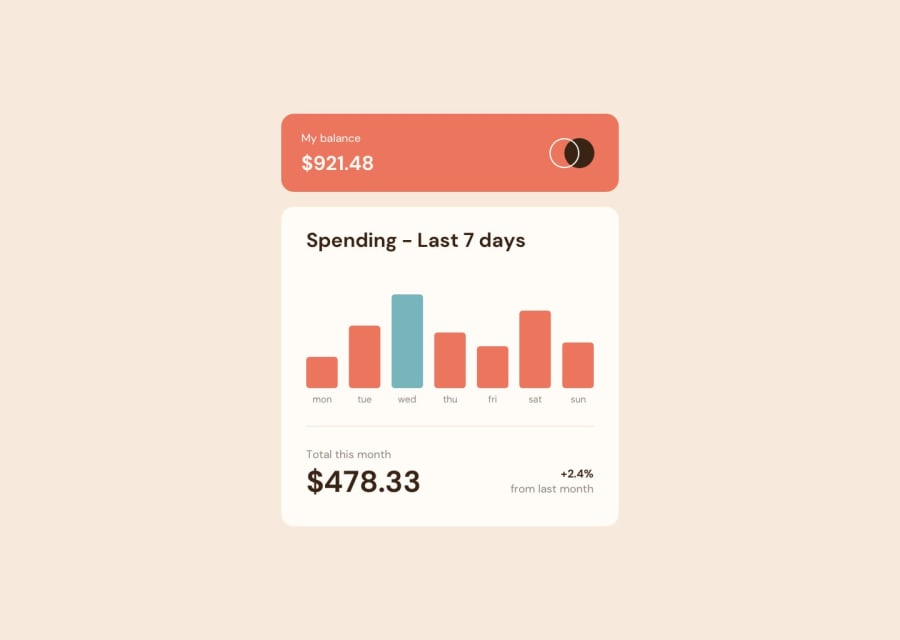
15th Task📊🔥 Very Happy with this one. Quick completion time, I think
Design comparison
Solution retrospective
Spent about 2:15 h on the layout and 1:15 on the javascript. I wrote it so that no matter how many days are added to the API, this will always use the last 7 days (though I shouldn't brag too much as that can be done in just one line of code), and the height of the bars will be set in relation to the highest value of the week, which will always have a height of 130px📊 The user can click on multiple bars to freeze the tooltips. I'm very, very happy with this one as I churned it out in about 3 hours and 40 minutes, give or take😃😃 got to learn a couple of new things and came up fairly quickly with a workaround for an issue I was having in regards to the use of CSS selectors.
Community feedback
- @josuez2006Posted 12 months ago
Fantastic work! I learned a lot by reading your code (it has good comments). In my solution, I didn't think about using the document.querySelectorAll and it made it more complicated than it could have been.
To be honest, you could improve it by using const variables instead of let as they don't change, but it's not so bad. I love how you used the map and forEach functions to reduce the amount of code as well as the consideration for touch actions on mobile devices.
I didn't expect the starting animation and it's amazing.
Overall, the only issue that I find in your code as well as mine is the responsiveness of the chart boxes because they're fixed to a certain height.
0
Please log in to post a comment
Log in with GitHubJoin our Discord community
Join thousands of Frontend Mentor community members taking the challenges, sharing resources, helping each other, and chatting about all things front-end!
Join our Discord
