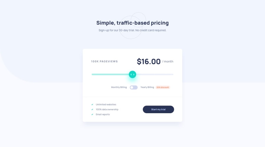
Design comparison
Solution retrospective
Ok, so I'm very, VERY happy with this one: it looks great on pretty much every screen size, and I figured out the layout as well as the javascript fairly quickly, and then I got to learn a few new things:
-
I had little experience working with range inputs, so I got a lot of practice, learned a few new tricks, and I'm very happy with how I figured out how to change the color of the range bar depending on how far the user slides😁😁(no need to create new divs or any other elements, just set the background color to a gradient and update the fill percentages in real-time).
-
I had no idea how to create the toggle inputs, I was pretty much expecting them to be a built-in type of input (e.g: <input type="toggle">), but it was very interesting learning that from scratch, and it was fairly easy to grasp.
All in all, really happy with how this one turned out and how long it took (about 5 hours) considering I had to learn qquite a few new things.
Community feedback
Please log in to post a comment
Log in with GitHubJoin our Discord community
Join thousands of Frontend Mentor community members taking the challenges, sharing resources, helping each other, and chatting about all things front-end!
Join our Discord
