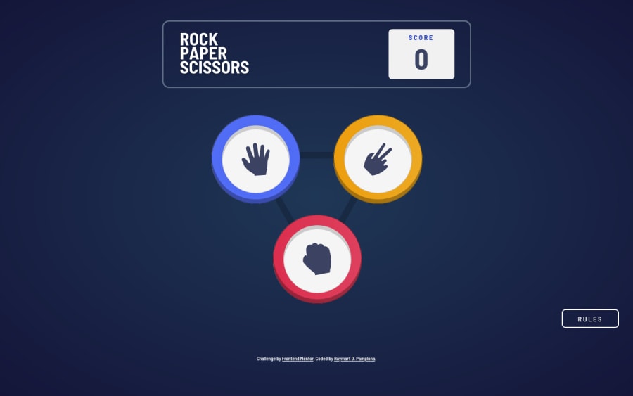
13th challenge with pure JS and SCSS^
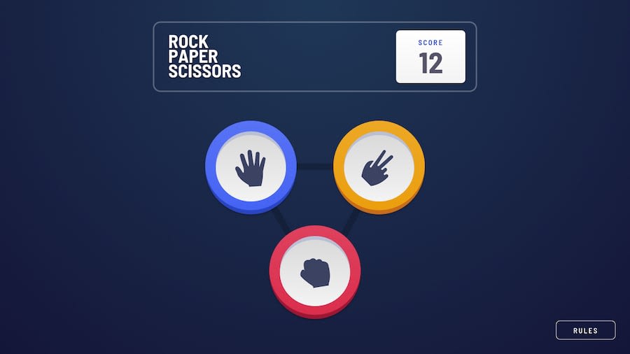
Design comparison
Solution retrospective
This challenge was really fun. My first draft was full of animation but I couldn't pull that one formula in terms of checking boundary so I had to remove it. Limited myself to using only few html elements. So I need to be very careful in my js since i'm just reusing those elements.
Anyway, have a look and drop your comments in my work^^. I will also create the spock version
Community feedback
- @bimalmagar10Posted almost 4 years ago
@pikamart Hey! This is totally amazing. Good one and animations are impressive.One thing I pointed out is that the score isn't decremented when we lose the game. This is kinda weird, isn't it? The rest is fine and all good. Happy coding!
1@pikapikamartPosted almost 4 years ago@bimalmagar10 Hey, well I see a lot of submission where the score decrements when they lose, and there are feedbacks saying that for their preference, they don't want the score to decrement when they lose. So I kind of based my logic to their preference. Because rock paper scissor doesn't really make you lose point right, what happens is both players must have their respective score. But still, preferences right and thank you as well for seeing it ^
0@bimalmagar10Posted almost 4 years ago@pikamart Okay! if that's the case then Hallelujah! I was feeling kinda weird because mostly, these type of games are made exactly like what I said.
0 - @ApplePieGiraffePosted almost 4 years ago
Hello, Raymart Pamplona! 👋
Just came to check out another challenge of yours! 😀 Amazing work on this one! 👍 I really like the animations that you added and everything feels very nice and works well! 🤩 Keep up this great work! 🙌
And keep coding (and happy coding, too, of course)! 😁
1@pikapikamartPosted almost 4 years ago@ApplePieGiraffe Hey sorry for the late reply hahaha just found out this. Thank you for the feedback and awesome that you liked it^^
1 - @DrKlonkPosted almost 4 years ago
Hi Raymart!
Reaaaaaally well done on this one. Looks good, works good. A nice example for everyone to follow.
Particularly, I like the little animation on the 'rules' text and the fact that you don't get points reducted when you lose.
A minor thing I found in the scss: I think technically the flex classes like
flex--j-betweenare utility classes and not variables. I'd expect a _variables.scss to contain only scss variables. But maybe that's just me. You could check out the 7-1 pattern to structure SCSS. I really like it.Just one minor thing I found in the code: in displayResult() the
winneralways gets set toplayerChoice, although I don't think it affects anything.Again, very well done!
Cheers, Joran
1@pikapikamartPosted almost 4 years ago@DrKlonk Thank you for the time at looking in the code:>
So I made a habit of creating
flexandgridthat way because I noticed that in the challenges here in FEM, you could achieve those layouts with just few selectors, adjusting only the gaps right. I treated them as modifiers especially when I nest different blocks. I really liked using them like this hehe but thank you for pointing that out.Oh yes thank you for checking that one out hahaha haven't noticed that one out. I just added it so that I could remove the animation to the winner. I had to add a lot since I limited to using few elements and reusing them only. Thank you really for the review ^^
0
Please log in to post a comment
Log in with GitHubJoin our Discord community
Join thousands of Frontend Mentor community members taking the challenges, sharing resources, helping each other, and chatting about all things front-end!
Join our Discord
