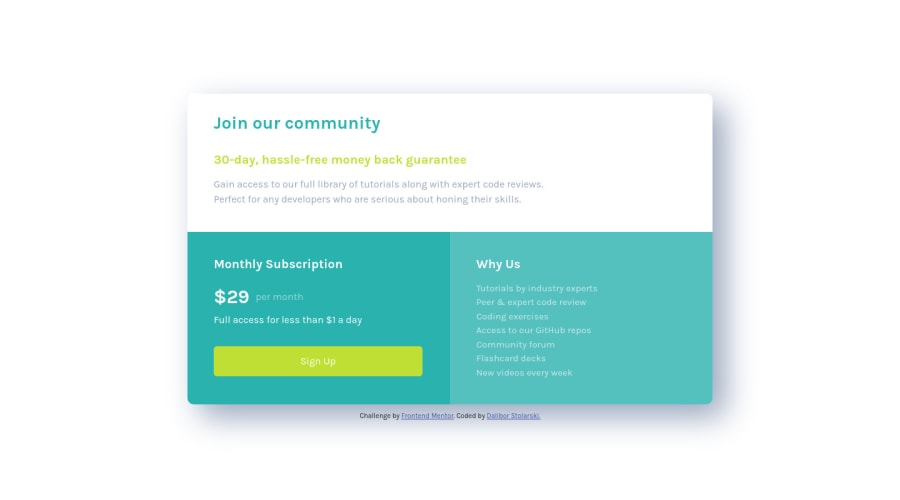
Design comparison
SolutionDesign
Community feedback
- @romila2003Posted about 2 years ago
Hi Dalibor,
Congratulations 🎉 for completing this challenge, your Grid component looks great, and it is great that it is responsive. There are some issues/suggestions I would like to address:
- Even though it is great that you wrapped the footer with the right semantic, you should also wrap the main content within the
maintag e.g.<main class="container"></main> - When adjusting the screen size from mobile to desktop, I would suggest removing the
paddingproperty on the body and writepadding: unset;as this will cause the box to look very squashed. If you want to center the card in desktop, then I would suggest using theflexproperty instead e.g.
body {
  display: flex;
  align-items: center;
  justify-content: center;
  min-height: 100vh;
  flex-direction: column;
}
Your box-shadow looks quite strong therefore I would encourage you to change the value to something like this e.g.
box-shadow: 10px 10px 10px rgba(0, 0, 0, 10%);. Also, I would encourage you to use a differentbackground-coloras one of the cards is white therefore, it would kind of blend it to the background.Overall, great work and wish you the best for your future projects so keep coding 👍.
Marked as helpful0 - Even though it is great that you wrapped the footer with the right semantic, you should also wrap the main content within the
Please log in to post a comment
Log in with GitHubJoin our Discord community
Join thousands of Frontend Mentor community members taking the challenges, sharing resources, helping each other, and chatting about all things front-end!
Join our Discord
