🤔🤔 Using flex and grid more than it should 🤔🤔
Design comparison
Solution retrospective
I finally sent my 10 project here FEM 🎉🎉🎉
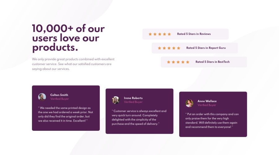
- In this specific project I think I used a lot of flex and grid, if you knew of any way to position the layout with fewer properties I would appreciate it.
- I didn't think the way I organized the tablet layout was very nice. I would like any suggestions, if I should increase the size of the cards or something like that
- Any other type of suggestion is welcome
Community feedback
- @pikapikamartPosted about 3 years ago
Hey, awesome work on this one. Desktop layout is great, it is responsive and the mobile state looks great. Just that the opening animation spikes the sites on my end though or maybe my laptop is just slow.
- On this, I would go with what you used on the main, a
gridto place the 3 main sections. But on the ratings, I don't really needflexorgridsince those are just simple block elements which will be placed on their own row so no need to use flex. Then I would just add amarginto the top and bottom of the middle rating to set them apart and usetransformto make the design. For the bottom part, 1 flex is enough for thesectionand inside each card, I would just use aflexfor theimgand person's info and not to the whole layout. - For the tablet, I think making the testimonial section have like 2x2 so that the cards won't be in a single one-column layout because it is using too much space.
Other suggestions would be:
- Stars
imgshould be hidden since those are only decoration. Decorative image must be hidden at all times by usingalt=""and extraaria-hidden="true"attribute on theimgtag. - Also, when using
sectionit always expects to have a heading tag inside it, it serves as like a label for the section on what it would contain. - In a
blockquoteyou should add the person's information inside, the image, the name all since you are highlighting the user inside it.
Aside from those, the site looks really great and it is great to see others using
clampfor other elements, starting to feel out lonely here.Marked as helpful3@MarlonPassos-gitPosted about 3 years ago@pikamart thank you Raymart for taking the time to evaluate my project, I'm grateful for that.
I hadn't really thought about using
transform, it would have made it a lot easier. And about the quote I didn't know about this one.About the section do you think it would be better if I change the untitled section to <div> or add an "invisible" title?
0@pikapikamartPosted about 3 years ago@MarlonPassos-git Definitely go with the screen-reader only text inside the
sectionso that there could be an extra information that a user will get. Since thesectionis on the ratings, you could use "website ratings" as the text-content.Marked as helpful1 - On this, I would go with what you used on the main, a
Please log in to post a comment
Log in with GitHubJoin our Discord community
Join thousands of Frontend Mentor community members taking the challenges, sharing resources, helping each other, and chatting about all things front-end!
Join our Discord
