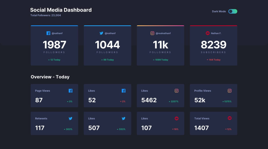
Design comparison
Solution retrospective
I tried to add some bonus features to this solution as a part of the learning process.
please feel free to give your feedback!!
Have a good Day/ Night
Community feedback
- @blockfl0wPosted over 2 years ago
I'm not sure why but your instagram
broder-top:style seems to not have border radius i'm not 100% sure but im guessing its since instagram has a gradient instead of a solid colour so i've found a relevent stack overflow discussion on it here that might help!Marked as helpful0@imadvvPosted over 2 years ago@blockfl0w Yes you're totally right, I tried many ways to achieve it, but didn't work, seem that have some work to do with
background-clip, I well check that discussion, and I will try to solve it again!! Thanks for your feedback I really appreciated!!0
Please log in to post a comment
Log in with GitHubJoin our Discord community
Join thousands of Frontend Mentor community members taking the challenges, sharing resources, helping each other, and chatting about all things front-end!
Join our Discord
