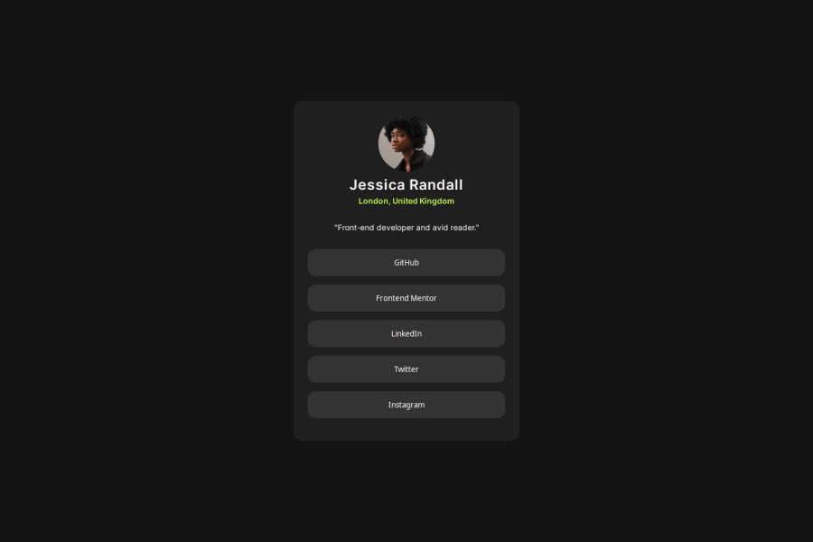
Design comparison
Solution retrospective
Another challenge completed with HTML and CSS. It may not be pixel-perfect, but I tried my best.
All suggestions are welcome.
Community feedback
- P@danielmrz-devPosted about 1 year ago
Hello @owlbunt!
Your solution looks excellent!
📌 Don't worry about pixel perfection, most of us can't achieve that without the design files. And many people can't do it even having the design files.
I have a suggestion:
- Since the social media are links to other pages, you could've used the tag
<a>instead of<button>.
I hope it helps!
Other than that, you did a great job!
1@owlbuntPosted about 1 year agoYeah Thanks for your suggestion i did it intentionally actually, to remove blue highlights when we click buttons bt it seems not working xd . anyways thanks for commenting @danielmrz-dev
1P@danielmrz-devPosted about 1 year ago@owlbunt
It's possible to remove that with CSS
1 - Since the social media are links to other pages, you could've used the tag
Please log in to post a comment
Log in with GitHubJoin our Discord community
Join thousands of Frontend Mentor community members taking the challenges, sharing resources, helping each other, and chatting about all things front-end!
Join our Discord
