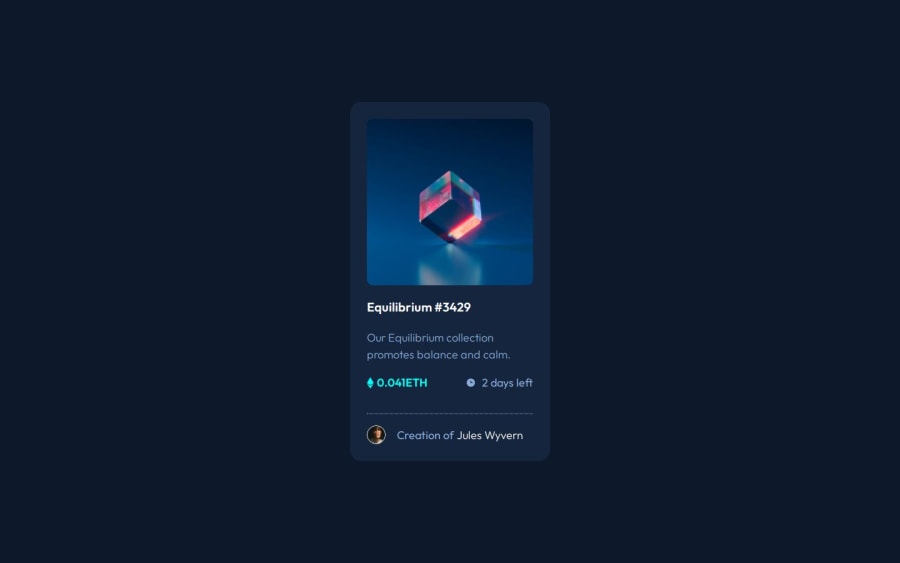
Design comparison
Solution retrospective
Turned out quite well, so happy happy! π
What challenges did you encounter, and how did you overcome them?While adding a hover interaction in the hero image of that neon background color and view icon. I took the help of my custom GPT. βπ»
What specific areas of your project would you like help with?Just one very specific part:
In styles.css, there is a particular section of .nft__overlay, along with its hover interaction code.
I would love to hear your thoughts on how that interaction could have been implemented more efficiently. π
Community feedback
- @imadvvPosted 6 months ago
greeting Shiv,
There are many ways to implement the hover effect. Your implementation works, but from an accessibility standpoint, there are some notes and improvements that can make it better.
Currently, the overlay is a focusable element while the
div
element is not!. "You can make it, of course, but it will require adding some specific data attributes." The more stand-fore way to improve this, is by changing thediv
to either a link (a) or abutton
. This will allow users to interact with the NFT in its active state.For the
nft__overlay
class, you can take advantage of CSS pseudo-classes to implement the view icon, as it is just a decorative icon and does not need to be included in the HTML structure. I made some changes to thenft__overlay
to demonstrate this:html line 25
<!-- <img src="images/icon-view.svg" alt="View icon" class="view-icon"/> -->
css
.nft__overlay { position: absolute; top: 0; left: 0; width: 100%; height: 100%; background-color: hsla(178, 100%, 50%, 0); display: flex; justify-content: center; align-items: center; cursor: pointer; transition: 0.3s ease-in-out; } .nft__overlay::after { content: url(./images/icon-view.svg); opacity: 0; transition: opacity 200ms ease-in-out; } /* Hover Interation */ .nft__overlay:hover, .nft__overlay:focus { background-color: hsla(178, 100%, 50%, 0.5); } .nft__overlay:hover::after, .nft__overlay:focus::after { opacity: 1; }
These changes will make your overlay more accessible and maintain a clean HTML structure.
Hope this give you some hints , Keep up the good work!
Marked as helpful1@undrthegraveyardPosted 5 months agoHey @imadvv,
Thank you so much for such well-articulated and detailed feedback. I really appreciate your effort on this.
I have tried to implement "CSS pseudo-classes" in my upcoming challenge. For sure, it makes life easier. Sometimes, it's hard to keep all the elements or properties at the back of the brain. I'm definitely at a level where I already know if some code is not being logical, and/or simple enough to make sense. So I try to take the help of my custom GPT to recommend some solutions or browse through documentation.
Anyways, thank you so much for your help.
Cheersπ
0
Please log in to post a comment
Log in with GitHubJoin our Discord community
Join thousands of Frontend Mentor community members taking the challenges, sharing resources, helping each other, and chatting about all things front-end!
Join our Discord