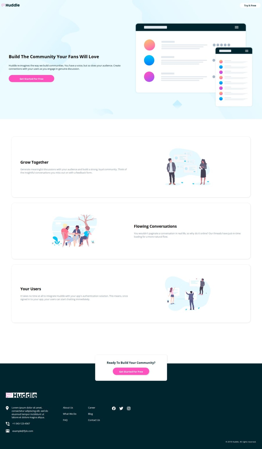
💎 Responsive Huddle Landing Page with Alternating Feature Blocks 💎
Design comparison
Solution retrospective
I'm super happy with this one, just perfect! 😁
I think I might need to start looking at accessibility as well a bit, it is always been something that I have been procrastinating on for a while. 😅
What challenges did you encounter, and how did you overcome them?One tricky part was to put the overlay component between the second section, and the footer. 😛
Last time, I was not able to do it, but this time I successfully placed it right. 💪🏻
What specific areas of your project would you like help with?One specific piece of advice I would like is on accessibility. ☘️
How could I improve my overall code for higher accessibility, I try to put the right HTML semantic elements but still, I think there is much more room for improvement. 😀
Community feedback
Please log in to post a comment
Log in with GitHubJoin our Discord community
Join thousands of Frontend Mentor community members taking the challenges, sharing resources, helping each other, and chatting about all things front-end!
Join our Discord
