


Design comparison
Solution retrospective
This is my first project built with React. And I think I did a great job! It wasn't as hard as I thought, though 🙃
See the README.
Design Note
I don't consider myself to be a master at web design --otherwise I should've made my own designs for my projects. But, there are some things that are obvious even for the dumbest.
If you remove underlines from anchors (aka, <a> tags), the thing which will strip away the very sign that a piece of text is a link, you have to give them some other sort of distinction to let them stick out. A shift in color or change of the cursor shape upon hover is not enough since the user needs to know that something can be interacted with before they do interact with it.
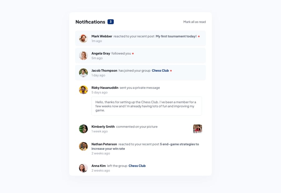
The only --hardly noticeable-- distinction made in the original design between links and non-links is that links are bold. This is bad design. We need our websites to be accessible by most users even if they have low vision conditions. Plus, boldness is not an evident indication that you can interact with text.
I didn't want to break the color system by giving anchors a strong color. Therefore, I kept the underlines, making it easy for everyone to see for clear what is a link, and what isn't.
Community feedback
Please log in to post a comment
Log in with GitHubJoin our Discord community
Join thousands of Frontend Mentor community members taking the challenges, sharing resources, helping each other, and chatting about all things front-end!
Join our Discord